Bologna Airport
Guiding the travel experience while improving the purchase funnels
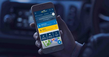
Achievements
+40%
Parking conversion rate
+37%
Session duration
-25%
Bounce rate
-23%
Calls to Customer care
The client
With over 8 million passengers in 2017, Bologna Airport is Italy’s 8th largest airport. Serving several regions of central and northern Italy, it is mostly used by outgoing passengers.
On the digital side, it has two main touchpoints: the website and the mobile app, that are not only vital to communicate the airport services and facilities, but also relevant revenue channels, allowing passengers to book and buy parking slots, lounge access and flights.
Visit website: bologna-airport.it
Context
When we travel, what do we look for on an airport website? What do we expect? How and when does the website become a fundamental support for the physical experience of leaving, arriving or transiting through an airport?
These were some of the key questions we had to face when we were invited to the tender to redesign the website of the Bologna Airport. We have grounded our approach and design process to provide robust solutions to these questions.
In July 2017 we won the tender and began working on the project.
On the business side, how many tasks does the Bologna Airport website do? We’re dealing with an information and service website, but also with 3 booking systems and e-commerces, and a primary communication channel for the airport, both in commercial and corporate terms.
The project’s objectives were exactly on these two fronts:
- improving the passengers’ experience
- improving all the e-commerce metrics, starting from conversion rates and revenue
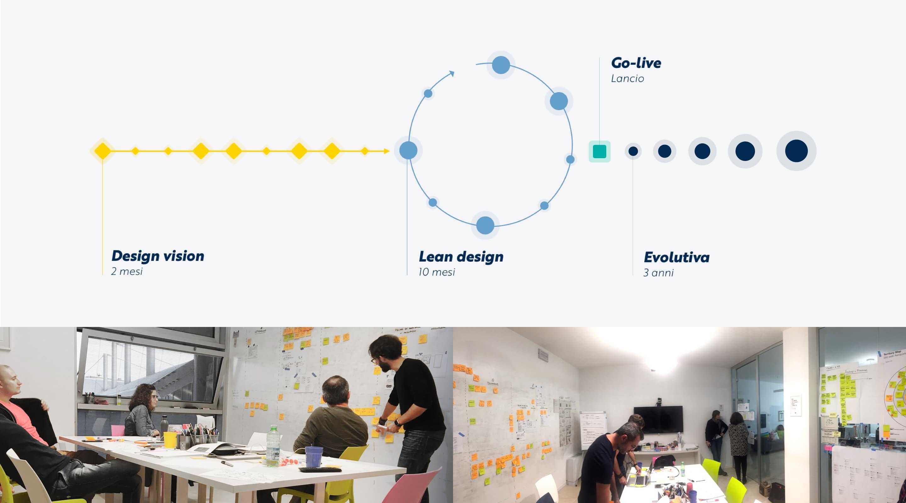
Finally, the project was distributed over 4 years: 1 for the redesign and 3 of continuous evolution. Therefore every decision had to be taken in this perspective, considering the short and long term opportunity, as well as the sustainability of design choices over a wider time horizon.
Right from the start it was clear the scope of the challenge posed by redesigning the website of one of the top 8 Italian airports by passengers number, which needed to be addressed starting from an in-depth phase of Design Vision, to understand the context.
"Tangible, word and deed. Their quality is not just visible, but tangible, always, during the whole life span of the project. The effectiveness of their method, their approach of putting users at the centre of the process, their strong technical and relational skills are their winning points.Also, their ability in listening to and managing requests emerging from the stakeholders and tackling critical phases (inevitable in such a long and complex project), allowed us to meet the planned deadlines."
Business + Users + Technology
In the first two months of the project we mapped and explored the context.
Since the kickoff we have worked to bring the internal stakeholders of the airport on board, bringing together all the departments involved in the project in a shared mapping of the digital and physical touchpoints, around the website, trying to bring out the respective areas of influence and decision.
This has allowed us to start a one-to-one interviews phase with the individual departments and managers, collecting company related background, business strategies and objectives, needs and expectations regarding the website, and to gain visibility of all the fronts going on alongside the website redesign, both on other digital projects and on infrastructures.
Meanwhile, our team has conducted user research, to explore and understand the points of the passengers’ journeys in which the airport website plays a fundamental role.
One of the key points of the tender documents, immediately embraced by the Bologna Airport, was to put the passenger at the center of the entire design phase.
The research with airport’s passengers has been divided into two phases:
- The initial exploratory phase, in which we got to know and deepen the domain through two research cycles: one inside the airport and one remotely through interviews with MyBLQ users (ie users registered to the website). The insights derived from this first phase enabled us to map the moments of the passengers’ journey in which the website had a fundamental role to play and what kind of need it was solving in each one of these moments. On this evidence we build a set of Personas and Journey Maps that guided the Design Principles for the Lean Design phase.
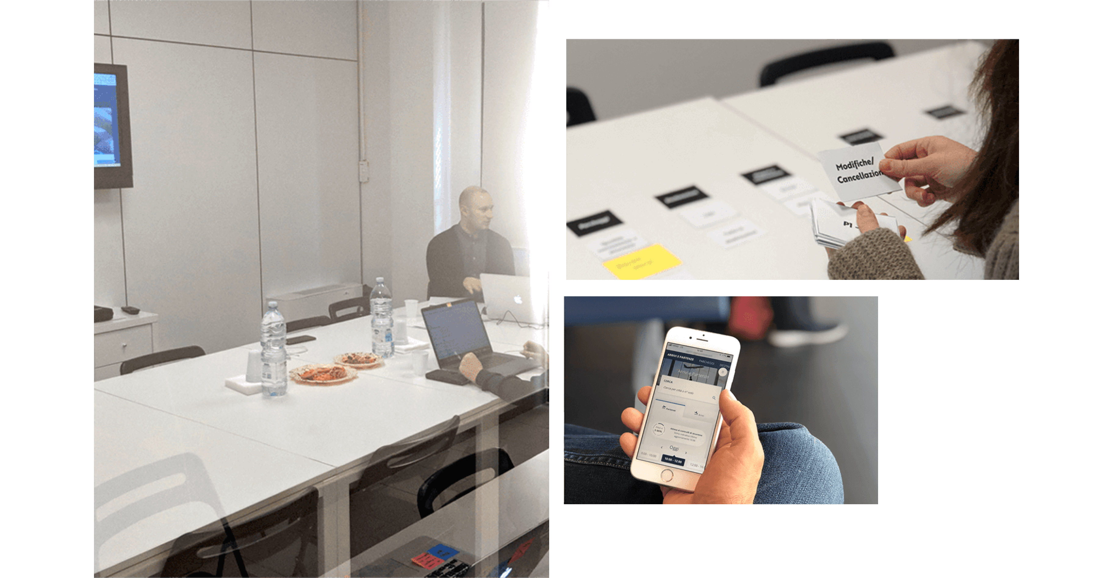
- With the subsequent iterative phase instead, during the Lean Design phase we validated the Design Principles. Tests were carried out through three laboratory usability test sessions using front-end prototypes and a guerrilla usability test session at the airport using a staging version of the website. The first two sessions enabled us to validate the design solutions used in the most critical conversion areas (car parks, lounges, destinations). The third laboratory session, on the other hand, was aimed at identifying problems in areas with greater information value for passengers.Finally, the guerrilla usability test session at the airport was an excellent opportunity to obtain qualitative feedback from passengers in real use context, with particular focus on the MyFlight feature, which allows real-time flight tracking and guidance on operations to be completed before and during the stay at the airport.
Finally, we worked with the various developers and system integrators including Endurance (official technological partner of Bologna Airport) to gather the status of the current website, map the systems involved, explore the possibilities and constraints of the CMS and coordinate roles and activities, sharing tools and best practices to work as one team, even if distributed.
One more step towards an inclusive design
The Bologna Airport website needs to be compliant with the Italian Law 4/2004 about accessibility, and therefore compliance with the WCAG AA guidelines have been an important requirement to be met from the beginning.
However, technical compliance seemed to us a simplistic answer to the question "How can we design a usable and meaningful experience for a visually impaired or blind passenger?".
For this reason we decided to dedicate a research session with visually impaired and blind people, organized with the help of Roberto Burceni of the Brescia section of the Italian Union of the Blind and Partially Sighted. This session, while being a valuable experience for the whole team, was an important opportunity to see how assistive technologies are used. The research, carried out during the exploratory phase, was based on the understanding of accessibility issues through the interaction with the old website which, although complying with the regulations, has brought out a number of critical issues clearly showing that accessibility is not only a matter of regulations.
Design Principles to guide 3 years of work
While the first part of the Design Vision was dedicated to research and gather the assets in order to explore the project’s domain, the second part was dedicated to organizing information and generating ideas to guide the design of the new website, taking into account a structured roadmap with a release after 1 year and a continuous evolution over the following 3 years.
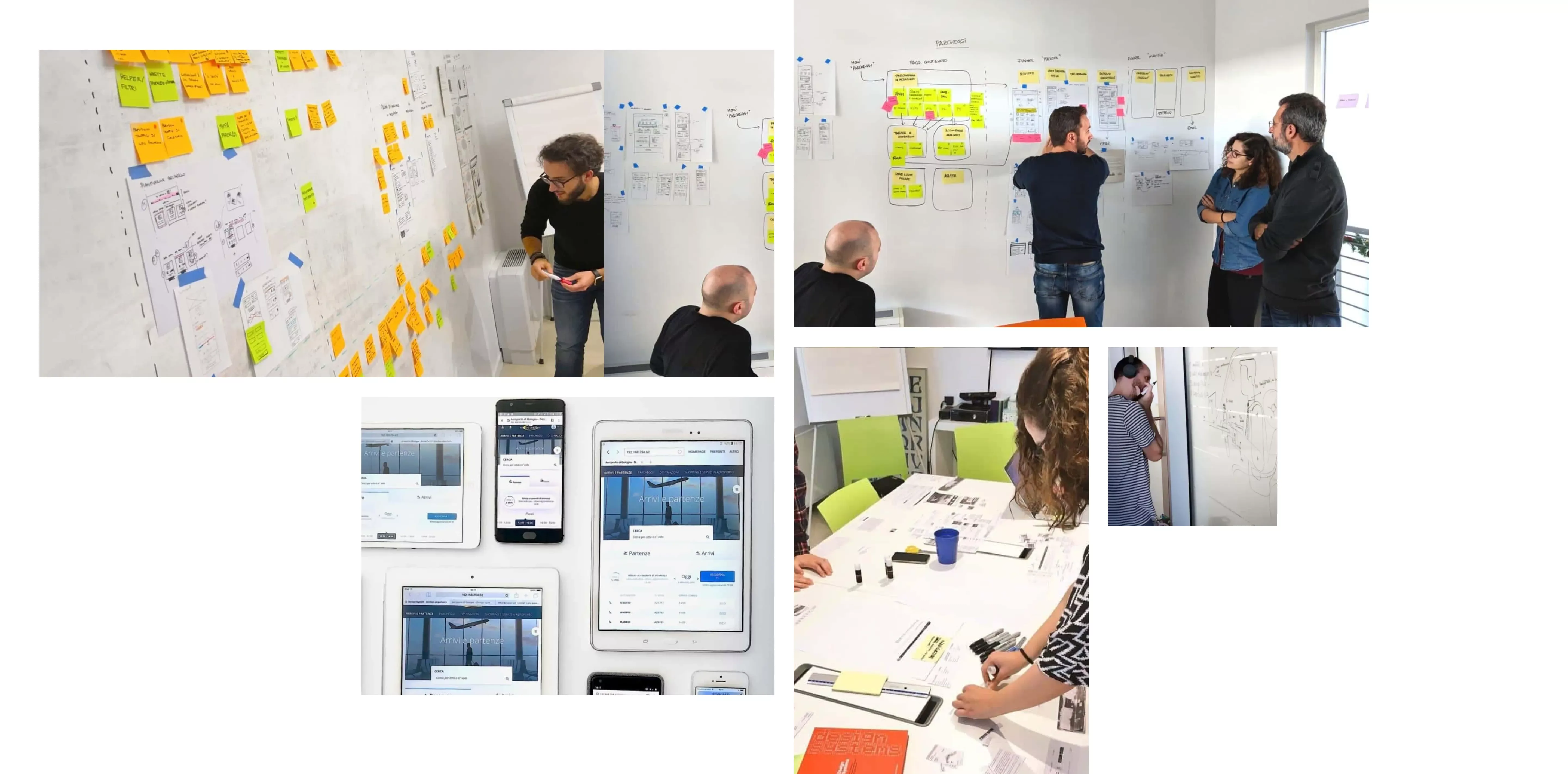
Starting from Personas and Experience Maps, we went through a codesign session to generate a series of ideas and solutions proposals, aimed at solving the pain-points of the current website, improving the key moments of the experience and introducing useful elements to achieve the business objectives.
To guide the work and set the right expectations with the entire project team and with the stakeholders, we organized these ideas according to logical groups and themes, related to the key moments of the travel experience or to the needs of passengers. We further ordered the proposals by feasibility and priority creating a backlog for the 3 years of evolution.
The Design Principles were born, the pillars of the experience and the design of the new airport website:
- At the right time: anticipating needs based on the context
- My BLQ: a personalized and relevant experience
- Before and after the journey: the airport as a travel facilitator
- Routes and needs: planning an experience for all
- BLQ now: the airport in real time
Design System, one atom at a time
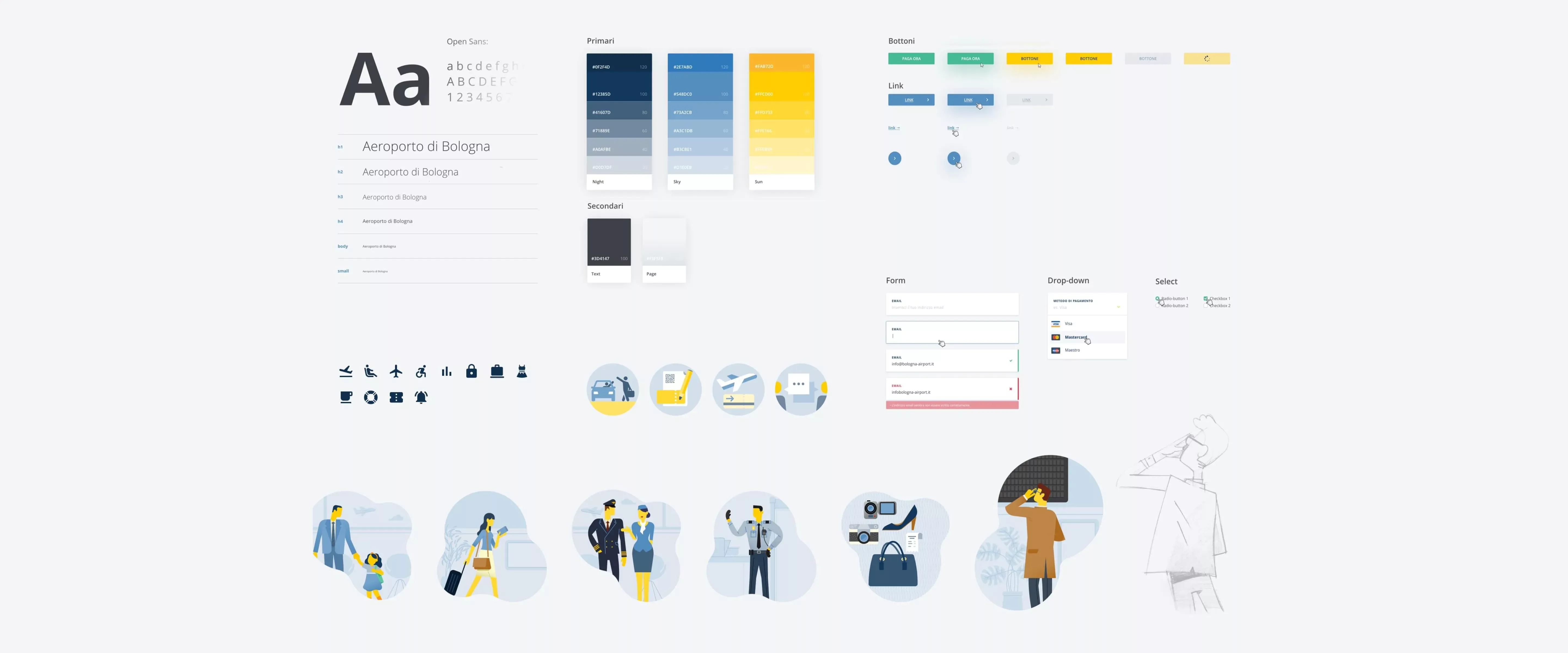
To guarantee a visual and functional language that is coherent and expandable, from the first design iteration of the project we started building a Design System.
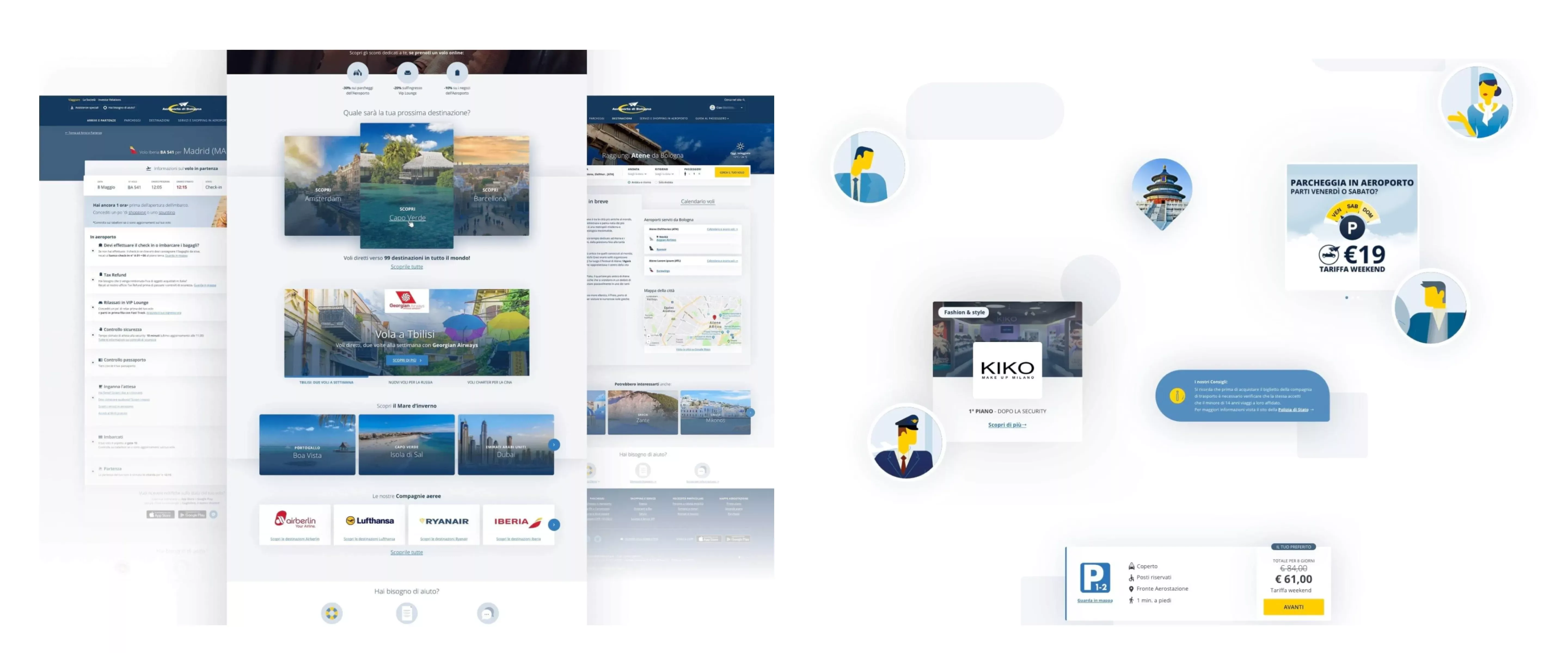
Working with a systemic approach to the project rather than with a "page" one, we generated a library of interface styles and components that have been used to create the entire user experience on the new website. This has brought visual and functional consistency serving as a reference point for all UI decisions, from brand to components, also allowing stakeholders to see components and flow prototypes as they were developed.
The Design System has also enabled external development teams to integrate the produced frontend code: the Bologna Airport system integrators have been able to access the Design System to check technical specifications of the components, use cases and rules of implementation, variants and code snippets to be used for implementation.
The Design System will support the Bologna Airport project in the years to come, being the point of reference for anyone who has to work on the website and guiding style and experience of future developments both on the website and on other touchpoints, as well as supporting communication and marketing departments.
To guide the development and the subsequent Quality Control phases, at the beginning of the project we analyzed the national and international internet traffic data and matched them with the mobile devices usage data. This resulted in a browser / device matrix for which we needed to ensure full usability, to do active testing during development and to focus QA on before release.
In order to validate the actual user experience, the functional test activities have been carried out on our laboratory devices. Furthermore, we have included a test phase with assistive technologies for visually impaired and blind users that took place at the Union of Blind and Partially Sighted People of Brescia testing laboratory.
All set, we're going online
New Bologna Airport website was released on November 7th 2018, together with a launch campaign created in partnership with the Airport Communications Department. This strategy allowed us to maintain consistency between website’s tone of voice and visual style.
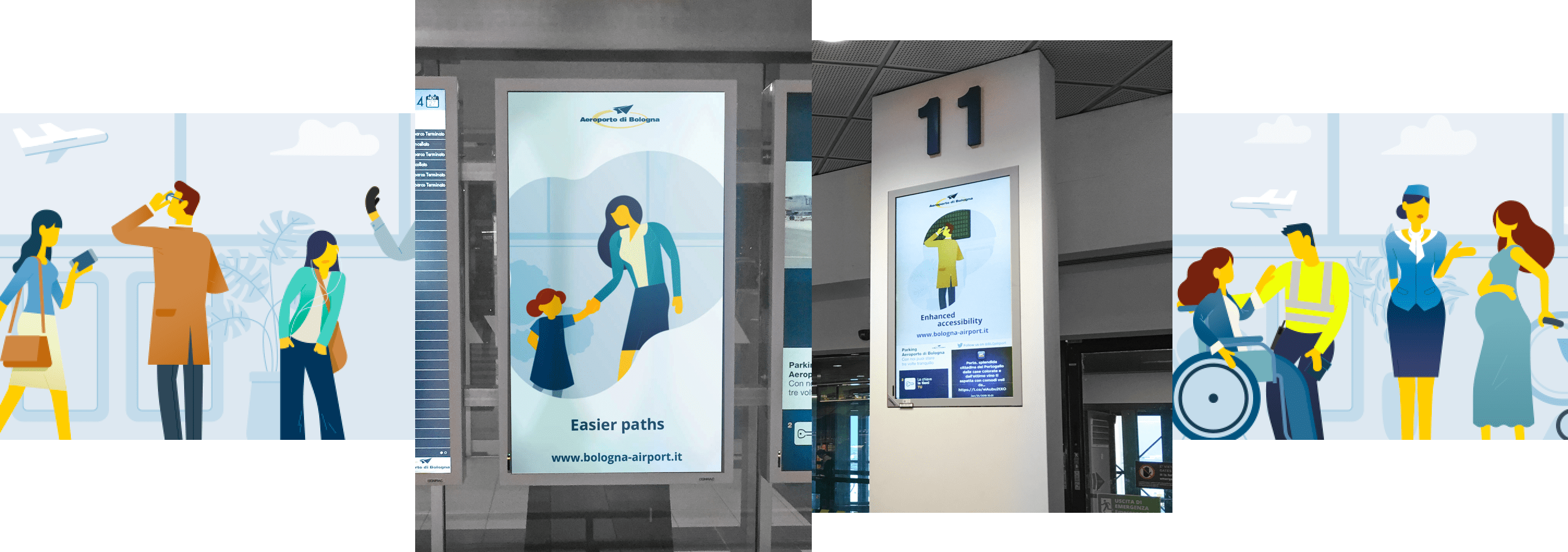
The focus of the entire communication campaign was set on travellers, the undisputed key players of airport environments. In order to describe how the new website could actually help families, visually impaired people and young travelers we created real life scenarios, using illustrations and short animated clips. When creating different scenarios, we took into account the time spent at the airport before and after the trip of both business and leisure travellers.
The launch campaign involved several communication channels. Together with the airport's internal team, we planned and coordinated synergically the entire online and offline campaign.
Before, during and after the trip
Thanks to the excellent work we carried out in partnership with Bologna Airport’s team and Golive, we had the opportunity to approach new interesting views on travellers experience at the airport and at every stage of their journey, namely before, during and after their trip.
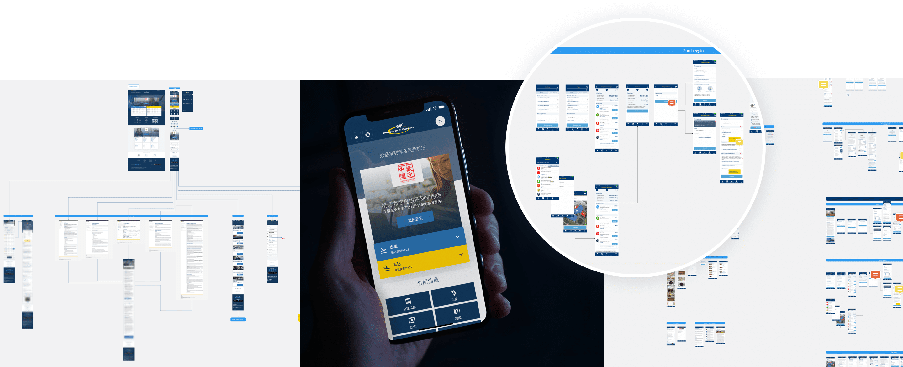
Furthermore, we were involved in a digital projects that aimed at re-designing and coordinating new Bologna Airport Chinese website contents. The project was carried out in collaboration with Welcome Chinese.
Our goal, and that of the Airport's internal team, was to create a traveller experience in line with the new Airport identity, both online and offline. Furthermore, it had to guarantee completeness of information and a linear experience between the physical and digital worlds for Chinese travellers. The project included a new dedicated website, the remaking of the entire internal signing in Chinese and the translation of food court menus. These were only some of the interventions that made of Bologna Airport the fourth facility in Europe to be honoured with the Welcome Chinese certification.
At the same time, we launched the evolutionary design of Bologna Airport App in partnership with Mavigex. During the next months, we will be designing new features and service logics for both the Website and the App. In addition to it, we will be aligning the entire iOS and Android interfaces to the new Airport visual identity, while planning the next app releases roadmaps. Starting from next year, the work carried out with our partner teams will come to life.
Our goal is to design an app that not only fits into the users' journey but can actually become a valuable tool for every step of the trip (before, during and after).
Measure and developing
We will keep measuring, analysing, collecting and monitoring relevant metrics from the new airport website. Our goal is to identify relevant insights in order to fully understand the user experience. By investigating how people interact with the new airport website we can collect useful data and validate business goals achievement while leading the evolutionary design of the website for the next 3 years.
Project team

Manuele Forcucci
Research, UX & Service Design

Martina Ferro
UX & UI Design

Luca Salvini
Front-end advisor

Paolo Valzania
Icons, Illustrations & Animations

Cristiano Erbacci
Front-end development
