Muse
An iPad app that rethinks the experience of visiting a museum, starting from the MUSE in Trento
Achievements
4 months
from idea to running product in the museum
The platform
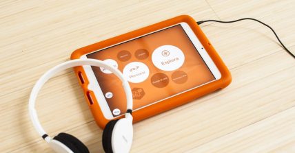
It is a modular platform developed and produced by GRAFFITI & MobFarm in callaboration with Giorgio Zanoni. EXMU is an interactive guide for multi-touch devices conceived for museums that intend to offer to their visitors a means of exploration enriched by multimedia contents.
Visit website: explora-museum.com
Idea
EXplora MUseum is born from an idea of MUSE director Michele Lanzinger and from the project “Smart spaces”, one of TrentoRISE and Trento goals for the next 3 years. Funded in part with public money, the project has been turned by TrentoRISE into a product and will be made available to several museums in Trentino (under free license), while it will be sold commercially to museums outside the region, generating a return on investment.
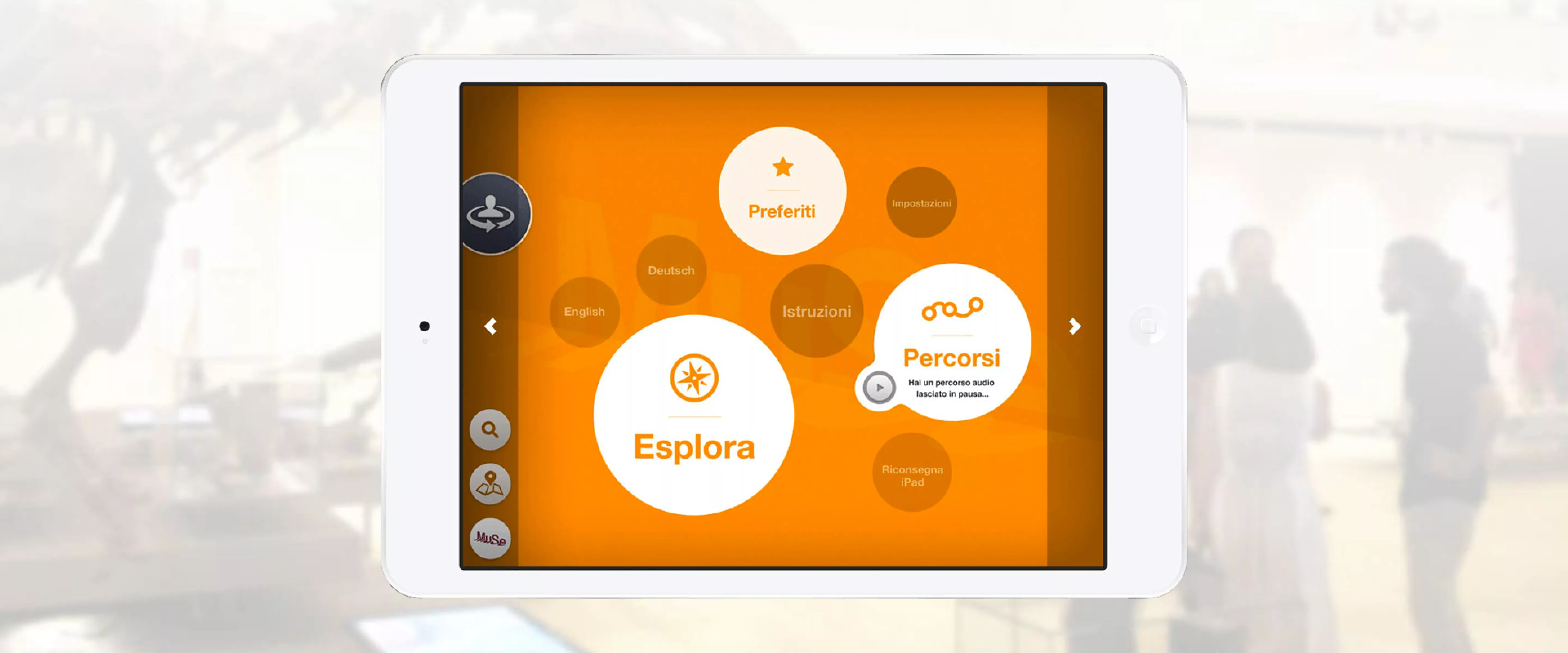
This pilot-project, lead by Sergio Cagol and Daniele Dalledonne, starts from the MUSE and requires the creation of a digital environment to support and empower the physical visit of the museum. The tablet app is the core component of this environment and is a multimedia guide for iPad designed specifically to the MUSE characteristics.
Context
The architectural project for the new MUSE started back in 2002-2003. Designed by Renzo Piano, the new museum is part of a larger urban requalification process of Le Albere neighborhood. The project has taken 10 years to see the light.
In several occasions, the museum director has explained the phylosophy behind the new Muse:
"We absolutely believe that learning is in the minds and in the eyes of people, in their eyes and their hands. Therefore we need to stimulate all sense of our visitors, knowing that they’re the main actors of the visit. We don’t dispense, we don’t deliver. We create a context for learning."

Our role
EXplora MUseum has been developed as a product by Graffiti and Mobfarm together with Giorgio Zanoni. The project has been signed-off in March 2013 and within a week the whole team met in the old museum, almost empty because of the relocation at that time, to begin working.
We’ve been asked by TrentoRISE to join the team during the first release of the app, to design the core parts of the user experience and the user interface of the app and get to a functional and testable version of the app by the opening of the new museum, on July 27th 2013.
Analysis, planning and iterations
We managed the project by iterations: a meeting with the whole team (including the product owner) every two weeks, face to face for the first month and remotely for the next months. During the first two iterations we visited the old museum, the new museum (still under construction) and the Mart museum in Rovereto, to understand the different contexts. We analysed the metrics of the museum (visitors, geographical distribution, age, etc.), defined users, scenarios and touchpoints, discussed with the team the minimum set of epic stories to deliver in the first release on July 27th: exploration and search of objects, sharing, guided visit through audio and text guides, organisation of pickup and dropdown of the iPads. Eventually we defined a roadmap of releases by ordering the stories by priority.
Making prototypes
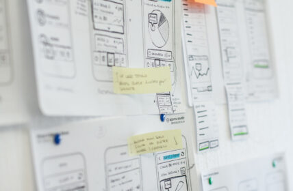
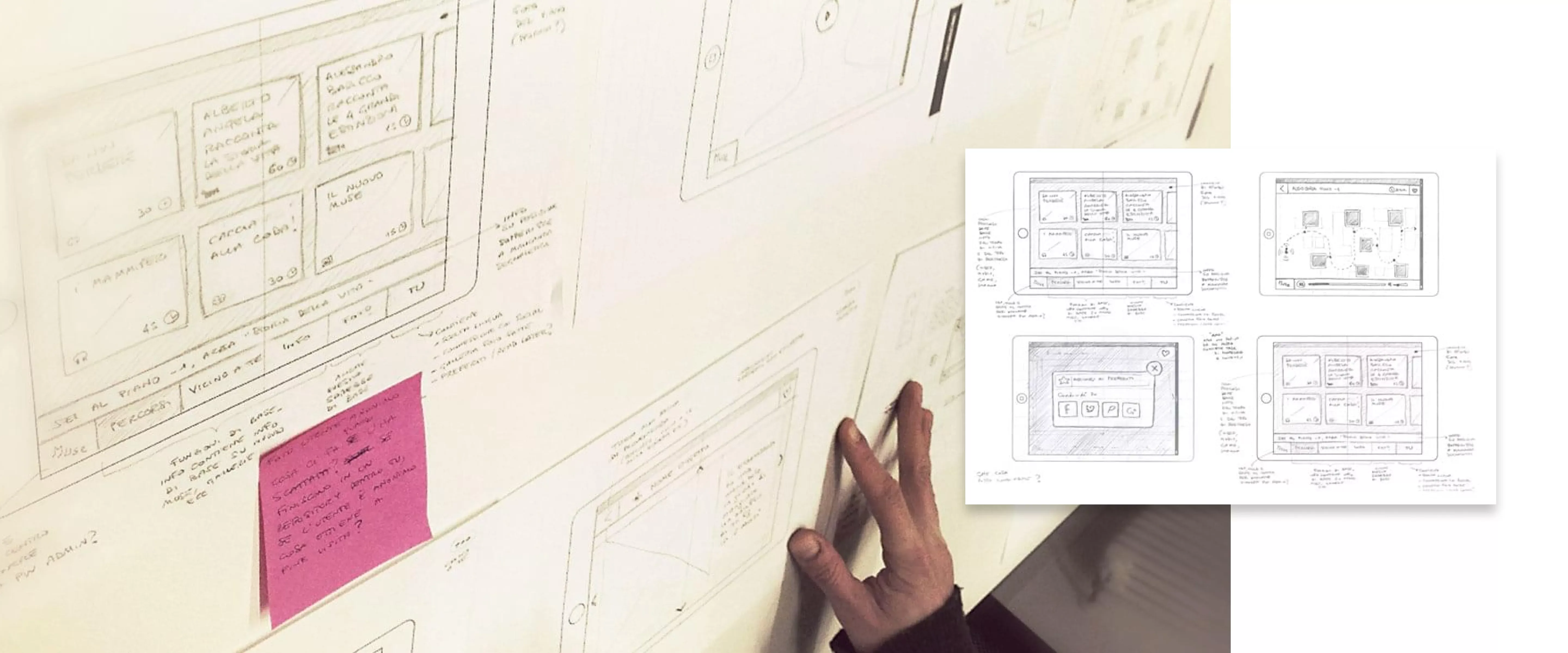
We believe the most effective way to work on an idea and involve a team in a discussion is working visually, rather than endless meetings and useless documentation that nobody ever reads. We worked in pari-design sice the very beginning of the project, using sketches, wireframes and Keynote documents to visualise concepts. This helped communication among the team, fueling brainstorming.We increased fidelity little by little, moving to an interactive prototype, adding more functionalities in each iteration. This interactive prototype, built with Proto.io and shared with the team remotely, helped us solve issues and clarify ambiguities, clearly spotting the main areas that we needed to test on the field.
Designing the interface
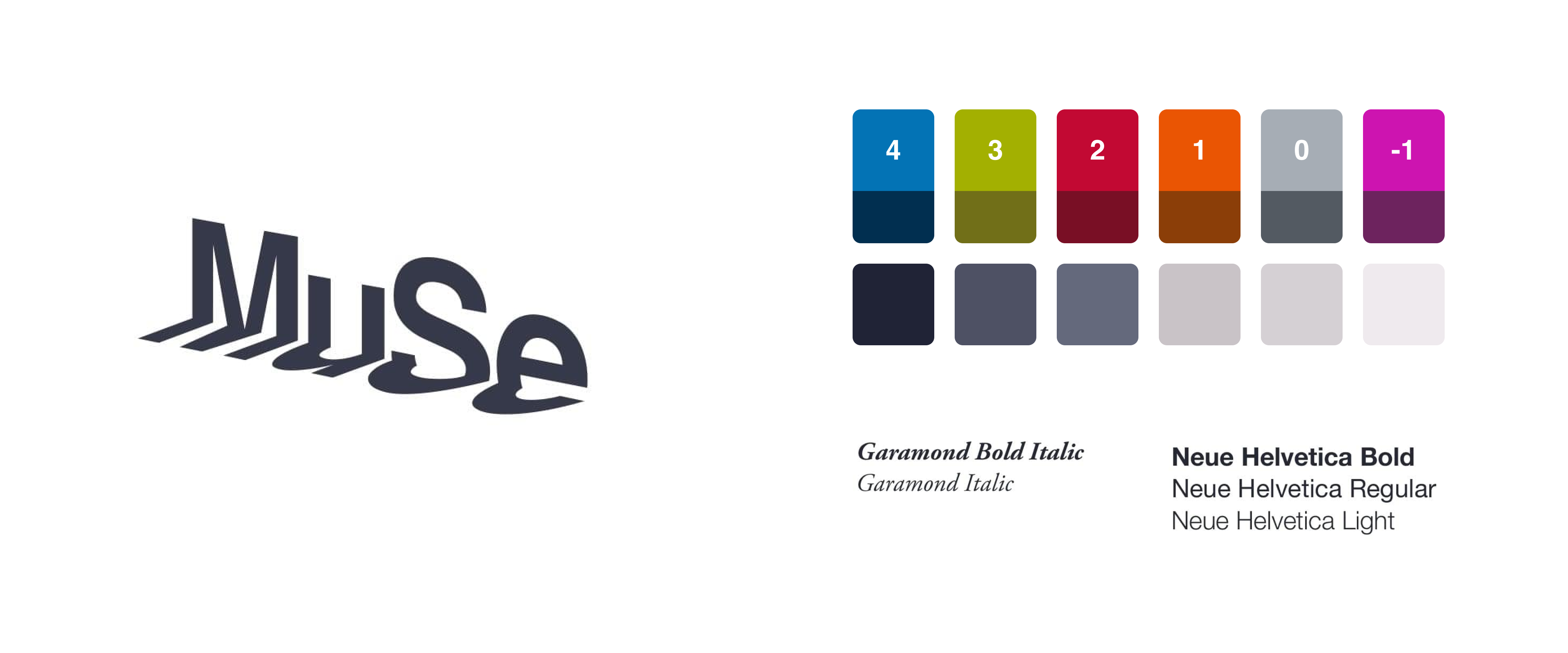
Once we defined the tone and a set of visual guidelines, we managed the User Interface design work by iterations, using every iteration to review, refine and improve the design choices taken during the previous iteration, and taking better decisions as we grew better understanding of the project.
#OpenMuse... and then what?
On a terribly hot July 27th, 2013, the new MUSE has been open to the public with a fantastic 24-hour long celebration. On this occasion, the app has been presented to a closed group of users and we have been able to run the first tests on the field, discovering the first areas that need to be improved. As usual, some issue were expected and known, while other users behaviours were a surprise. Graffiti and Mobfarm are now taking on the project and going on with the development: we provided them with a report of the crucial activities that need to be addressed in the next months, when other releases of the app are due.
