Thinking
Lesson Learned: our experience in designing a website template
Creating a website template means focusing on designing a general layout, design elements, and key functionalities that can be reused to create different websites.

A website template is a predefined set of design elements, layout, and functionalities used as a foundation for creating one or more websites. These templates provide a customizable base structure to meet the needs of entities or businesses within the same sector.
Typically, these products offer various types of page templates useful for building the entire site, such as the homepage, first and second-level pages, and leaf pages.
Designing a website template presents several challenges, including integrating the diverse needs of various stakeholders into a single product. However, adopting a template can save time and resources when working on similar projects or when there is a desire to create a series of sites with a consistent look and structure.
General characteristics of a website template
The design of a website template follows the same phases as a custom site; the substantial differences lie in the principles guiding the design:
- Flexibility: It must adapt to the needs of different entities, allowing modifications in layouts and functionalities.
- Scalability: Designed to be used by multiple businesses while maintaining the possibility of customization for each.
- Adaptability: Includes modular sections that can be activated or deactivated based on the specific needs of the entity.
Thus, a website template follows the same design steps as a custom site but is guided by different principles that make it adaptable to multiple entities.
A custom site is structured in its layout and functionalities based exactly on the specific needs and requirements identified by the business and its reference users through the research phase. Generally, in these cases, we talk about B2C (Business to Consumer) design, carried out in collaboration with the business but directly oriented to the final consumer.
A website template, on the other hand, is generally designed to meet the needs of multiple entities, usually operating in the same sector or context. It must therefore adapt its layouts and functionalities to a much broader and varied range of scenarios. It is created with the basic idea that the business can make its own, becoming part of the final product design by adapting the proposed templates to the content it needs to communicate to its final users. In this case, we can talk about B2B2C (Business to Business to Consumer) design, aimed at multiple businesses that can then rework the proposed model based on their needs to target their users.
This aspect also affects the final output delivered at the end of the template design. While a custom site is released as a finished product, a website template is released at an earlier stage, requiring a content analysis to adapt the proposed templates to the business's communication needs.
Stakeholder involvement
Designing a website template is tied to meeting the needs of a wide range of users and stakeholders (entities, IT providers) who can have very different characteristics. It is necessary to involve them as much as possible, defining moments of research, comparison, and feedback collection to gather the information needed for design and validate design choices along the way.
These comparison moments can coincide with the crucial phases of the project:
- Initial Phase: Gather informational and operational needs, constraints, and specific requests to consider.
- After Designing the Information Architecture and Navigation Flows: Validate the coherence of the information organization method and the intuitiveness of the proposed navigation paths.
- After Designing the Interface: Validate the structure of the templates and check if they meet the stakeholders' communication needs.
Having this continuous dialogue with stakeholders and users allows us to proceed informed and quickly resolve any issues that may arise during the design process.

Flexibility of information architecture
The keyword in designing the information architecture is flexibility.
How many and what first-level items might the most complex entity with many contents need to organize?
How many and what first-level items might a smaller entity with fewer contents need?
Are there sections that could be turned on or off as needed without disrupting the logical flow of navigation?
These are some of the main questions we asked ourselves when dealing with the definition of the information architecture of a template.
The lesson learned is that generally, the best solution is to provide first-level items that can adapt to any entity, regardless of the amount of content to be intermediated through the site. Leaving the management of subsequent levels more flexible allows the entity adopting the template to have different granularities and types of content depending on their needs.
Designing adaptable and modular layouts
The design of page layouts must also always be oriented towards flexibility. The template must adapt to potentially very different realities, which may have more or fewer contents to convey.
A good practice is to design page templates in a modular way, providing different sections and, if necessary, subsections that can be turned on or off based on the type and amount of content to be intermediated. However, there are sections of templates that are necessary for the page to make sense and be implemented.
Another suggestion is to think about worst and edge cases, always asking what the worst cases might be and simulating how the template pages might be configured with minimal and maximal content. Benchmarking can also be useful in this case, allowing us to identify examples of content to test the designed template pages.
Designing with a mobile-first approach and providing guidelines for tablet and desktop is a good practice that avoids the need to design all views in all formats but allows presenting the project in a single format accompanied by specific cases of particular relevance.
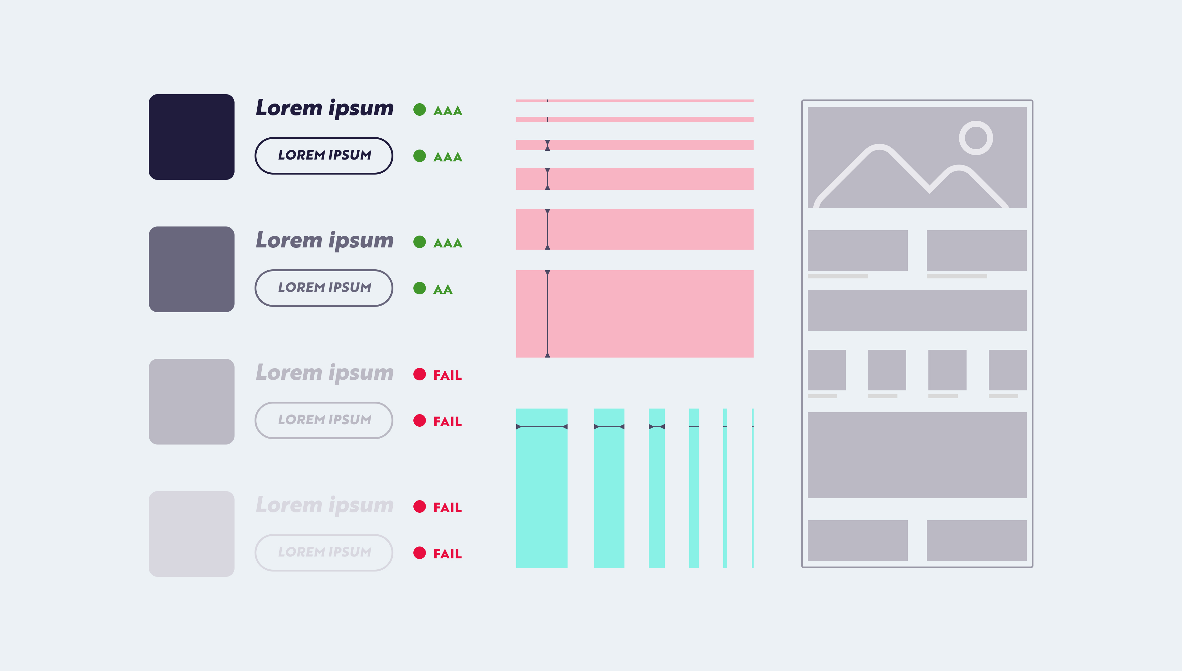
Consistency of design and documentation
A website template must ensure consistency in design and user experience, maintaining a uniform brand image. Clear and comprehensive documentation is essential to help those using the template build the final site and must include:
- Design Rules: Principles followed and the process of realization.
- Description of Sections and Interfaces: Functionalities and general structure.
- Technical Details: Functioning of interactions, animations, and behaviours of various elements.
Creating flexible and scalable website templates
Each phase of template design plays a crucial role in ensuring that the final product not only meets clients' needs but also allows them to build their own site to offer a consistent and intuitive user experience.
Through active collaboration and clear communication with stakeholders, it is possible to gather valuable insights that translate into layouts and templates reflecting the needs emerging from the research. Attention to detail in designing UI elements ensures that every interaction with the site derived from the template is pleasant and functional.
Finally, clear and comprehensive documentation supports those implementing the site in setting up a coherent and effective user experience.