Comet
Streamlining information from homepage to navigation
You need to read this case if you are interested in:
redesigning your service by integrating it with pre-existing systems;
making your product/service mobile friendly;
streamlining navigation and flows of your product by analyzing quantitative data;
increasing the effectiveness of search systems and listing pages;
expanding the possibilities of your service to a new target audience;
having a working process that takes into account advancements with measurable impacts;
coordinating different actors who contribute to grounding your service.
Context
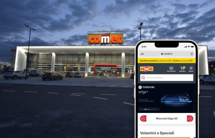
For over fifty years, the Comet Group has been active in the distribution of household appliances, lighting fixtures and electrical equipment. With more than 110 outlets distributed mainly in central/northern Italy, Comet is recognized for the quality, competence and helpfulness of its store associates. This expertise, in an ultra-competitive market, is the key to local customer loyalty.
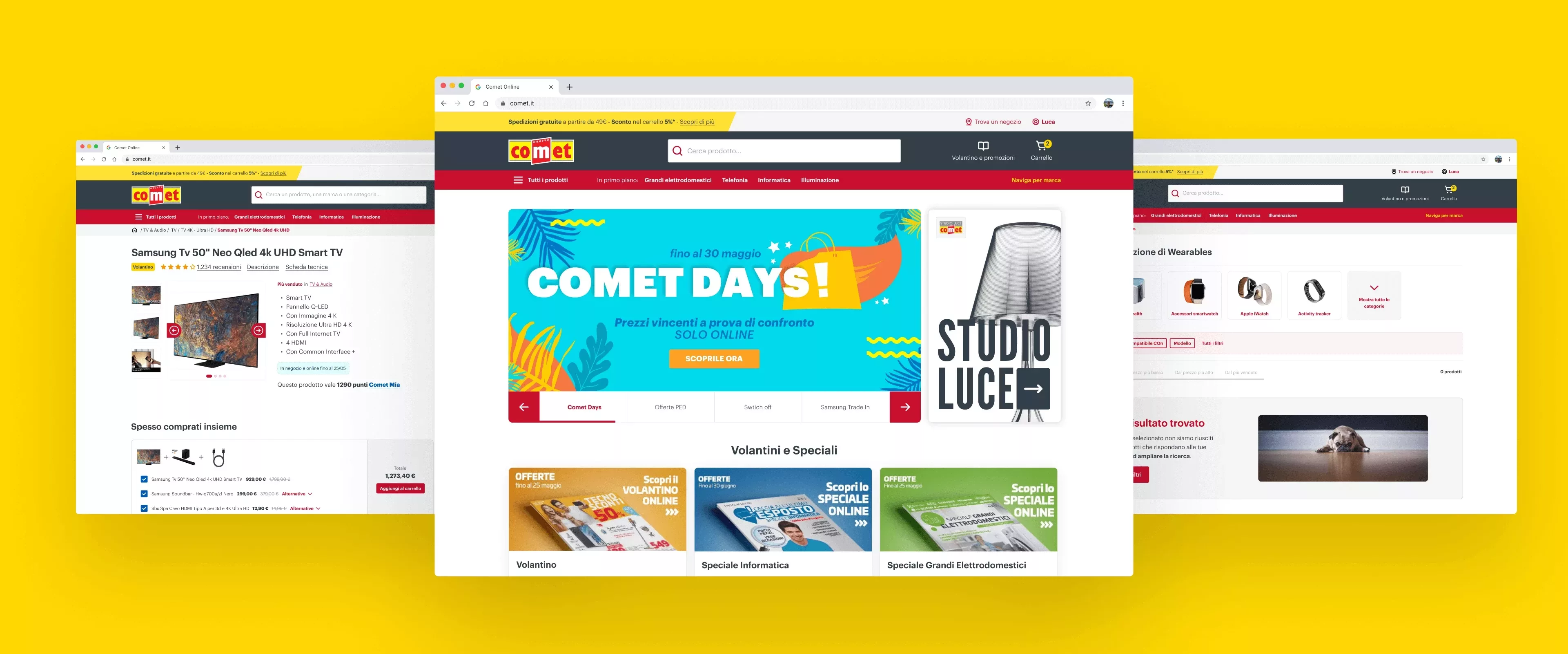
In this scenario, the challenge was to renew the image and interaction of the site without losing contact with the people in the area who reward Comet with their trust every day while opening the door to those who live far from the stores and are accustomed to digital interaction, especially in those stages of the purchasing process where the search and use of information is mobile-first. In addition, it was necessary to communicate the newness of e-commerce without giving the impression of breaking away from that familiar reference point.
Streamlining information from homepage to navigation
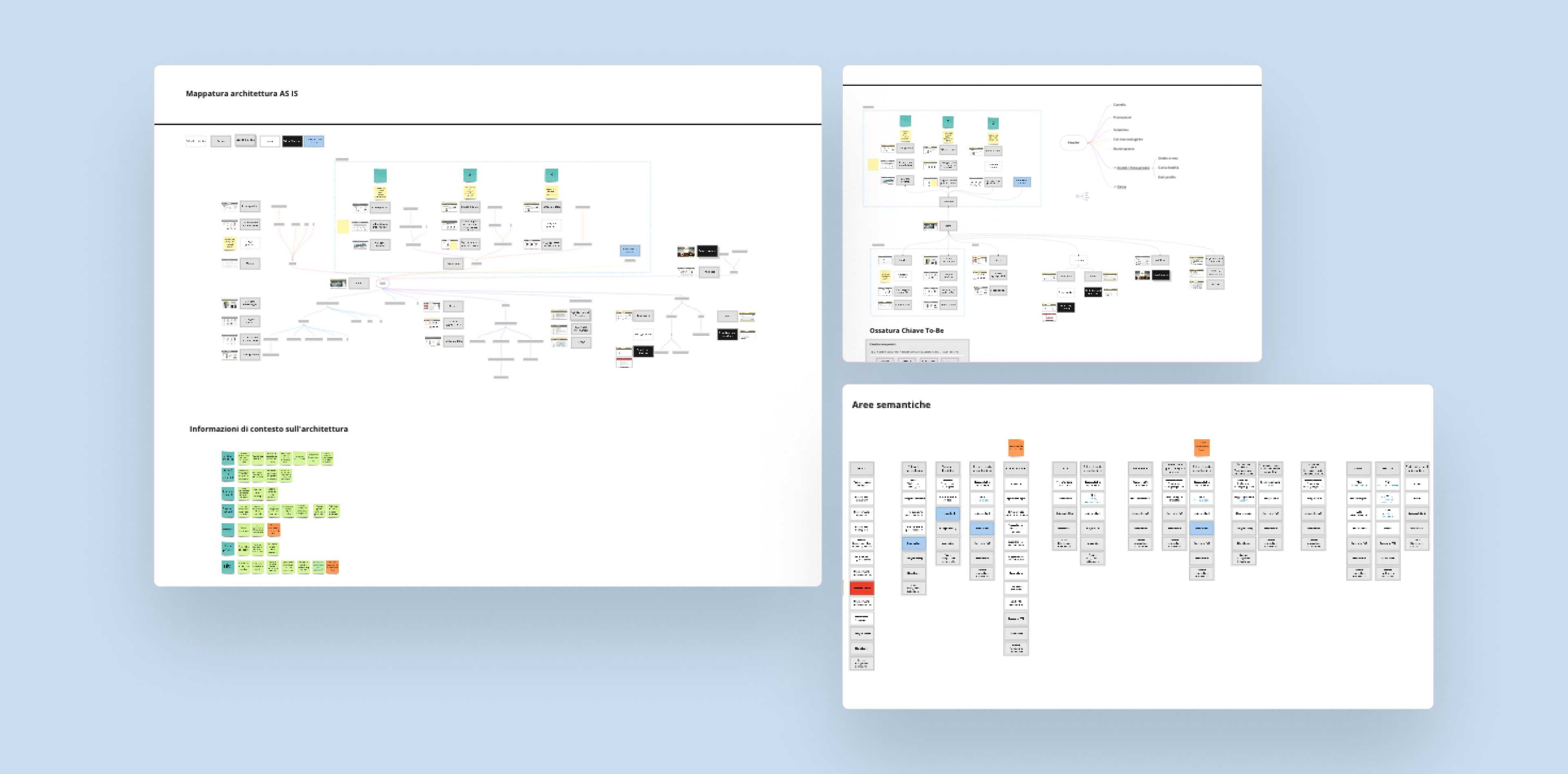
A comprehensive and thorough data-driven analysis of the browsing and purchasing behaviors of regular users helped us define key usage scenarios from which to rationalize the fragmented set of offers, promotions and content that the site offered, thus arriving at a skeleton of semantic areas within which to operate. This allowed us to immediately achieve greater clarity of information and greater orientation in navigation. This same schematization was then the basis for defining the guidelines in the restyling of the entire site.
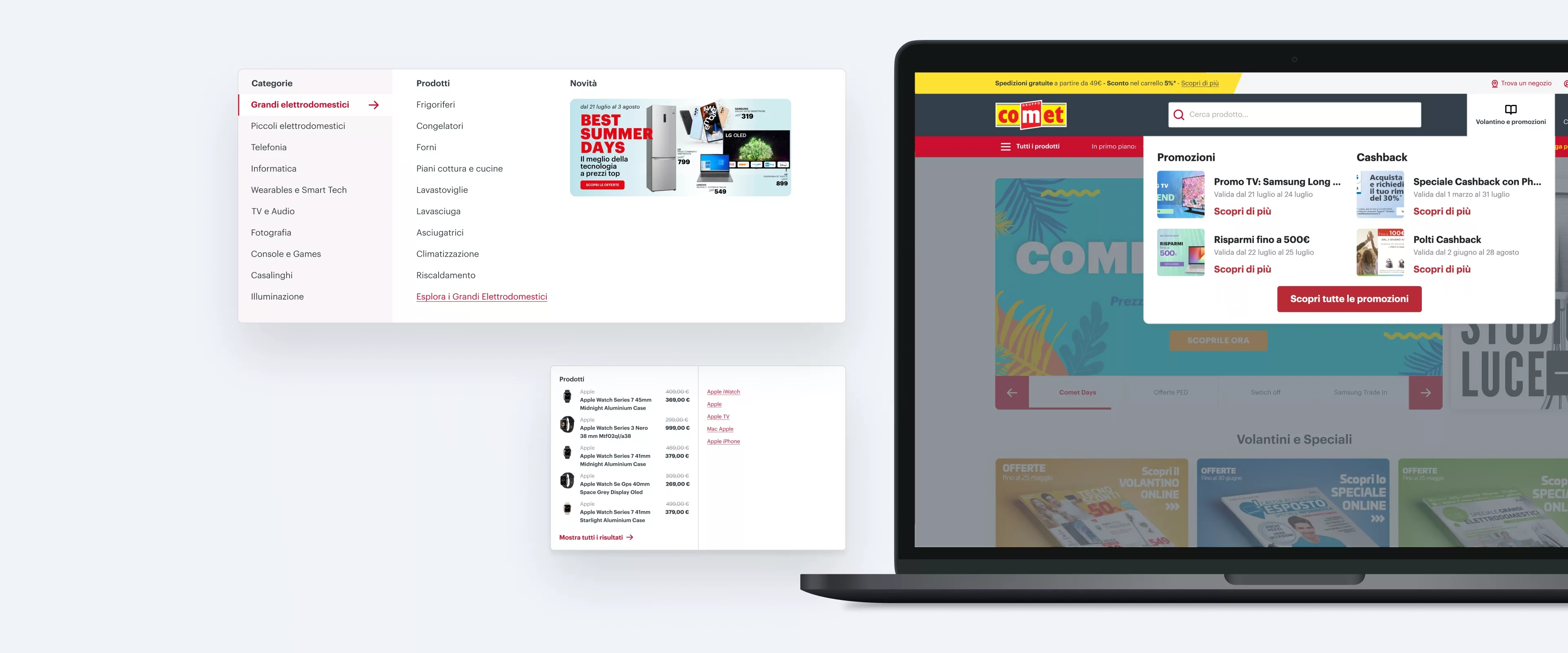
With such complex systems built at different moments in time, articulated navigation becomes a hindrance to the usability of the site itself. Our main goal was to simplify navigation by eliminating, for example, long lists and some superfluous steps of the entire path to an optimization of the product tab, the core of a performing e-commerce company. Thanks to the collaboration with the SEO& Performance Marketing agency, we adopted solutions that did not compromise what the search engines needed for ranking. At the same time, they did not lose sight of ease of navigation for the end user. Solutions summarized in a reduction of users’ steps and a semantically more suitable and modular navigation system was achieved by restructuring the filter system and revisiting the listing pages.
Immediacy and clarity: the product sheet
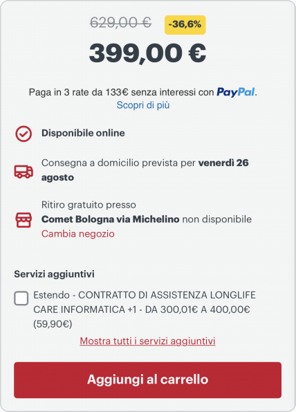
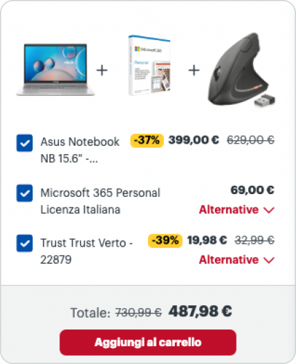
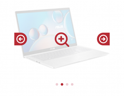
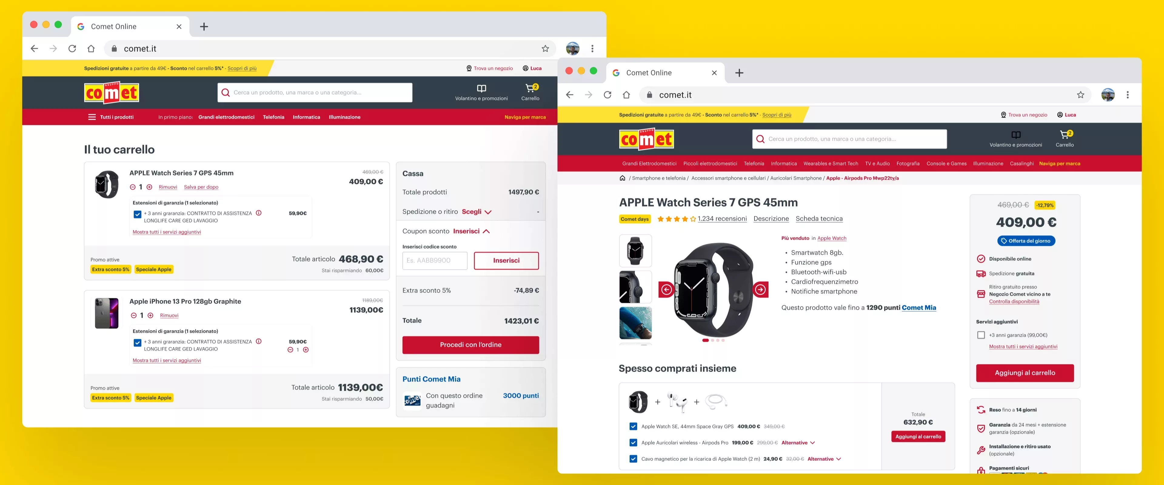
For an e-commerce store, the product sheet is the key of the entire shopping experience: this is where trust is built, doubts are answered, and the user is guided to the best shopping cart setup for their purchase, where finally, they are led by the hand toward making the purchase.
In collaboration with the IT department and logistics, we worked to make sure that the purchasing process took into account all technical and process constraints and was integrated into the pre-existing check-out system. In particular, we worked on three aspects:
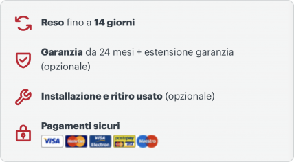
Defining a set of interaction that would enhance additional services otherwise visible only at the check-out stage
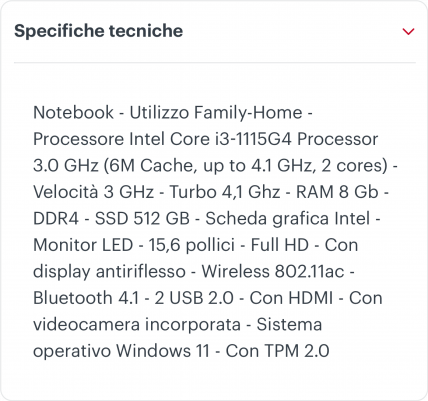
Rationalize information into semantic areas to make it easier to read
Anticipate service information such as, for example, pickup information, shipping costs, etc.
All of this helped to increase the level of customers' trust, even those who were not familiar with the Comet Brand because it did not have its own stores in the area, which translated into an increase in turnover and in particular an increase in the average receipt.



Design system and UI choices
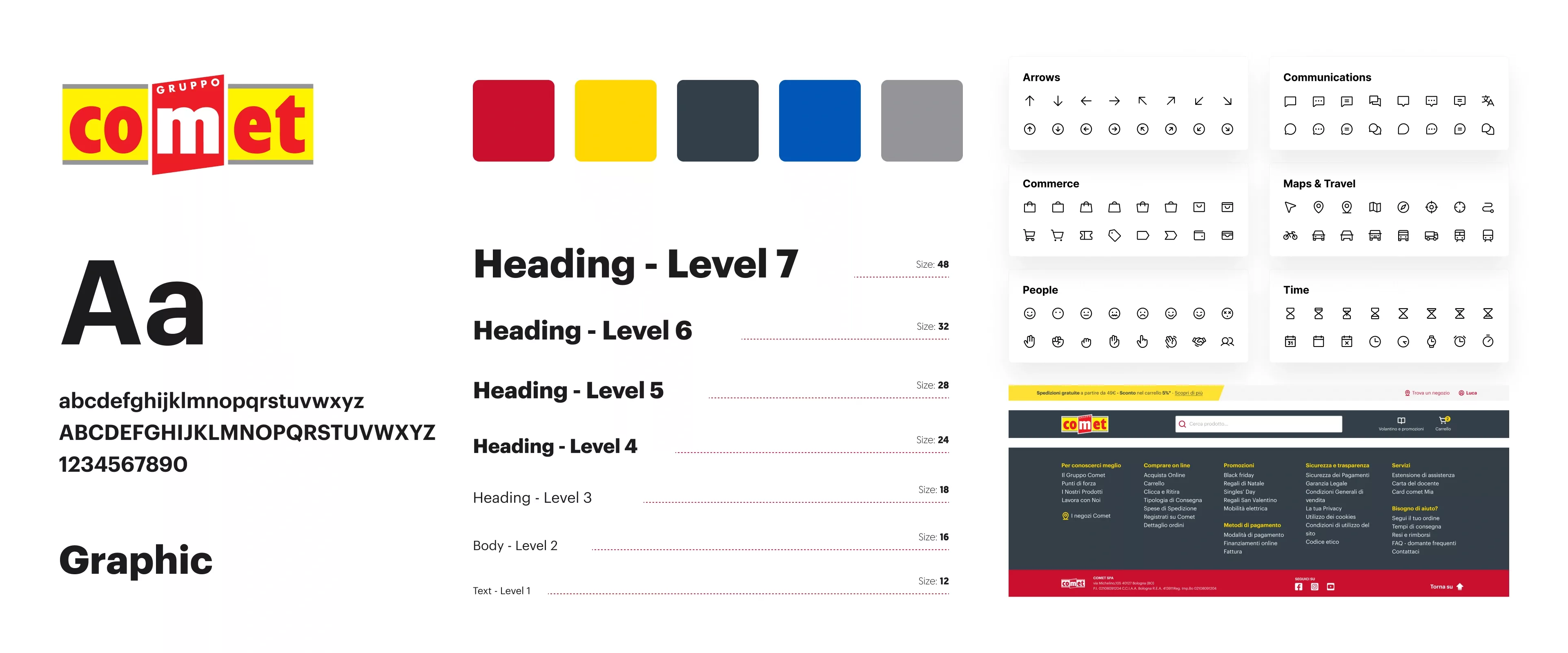
A design system is a shared collection of components, patterns, usage rules, and best practices that enables the team to design effectively, consistently, and most importantly, with high quality standards.
For a product of the scale of Comet's e-commerce, it is critical to have a design system. It helps maintain efficiency in the exchange of information, in both directions, between the design team and the development team; it allows us to ensure consistency across the board, even into neighboring touchpoints; it increases the quality of design and code; and it supports the fulfillment of accessibility requirements.
The design system we have built, and the resulting visual language, is based on having listened, taken on board, and centered the brand's history, stakeholder visions, and business goals. Constant discussion with the client and iterations based on feedback allowed us to enhance the brand digitally while maintaining continuity with the physical world and the in-store experience.
Designing with and for data
During the analysis phase, we considered different sources of data, while in the design phase and in the e-commerce post-launch phase we defined a clear framework for reference and comparison. The definition of indicators helped us to carry out experiments in the delivery phase supported by a/b testing and constant measurements, making it easy to modify and adapt some solutions directly in the process.
Conclusion
"Our design is geared to create impact" and this is especially relevant in an e-commerce project, where even a small variation generates considerable changes in results.
Again, as in other projects, the key was the quick learning of both the context and the effectiveness of the solutions, made possible by our agile design process for digital products.
Want more information about this project or would you like to discuss a similar project for your business?


