Mintlayer
A block explorer within everyone's reach

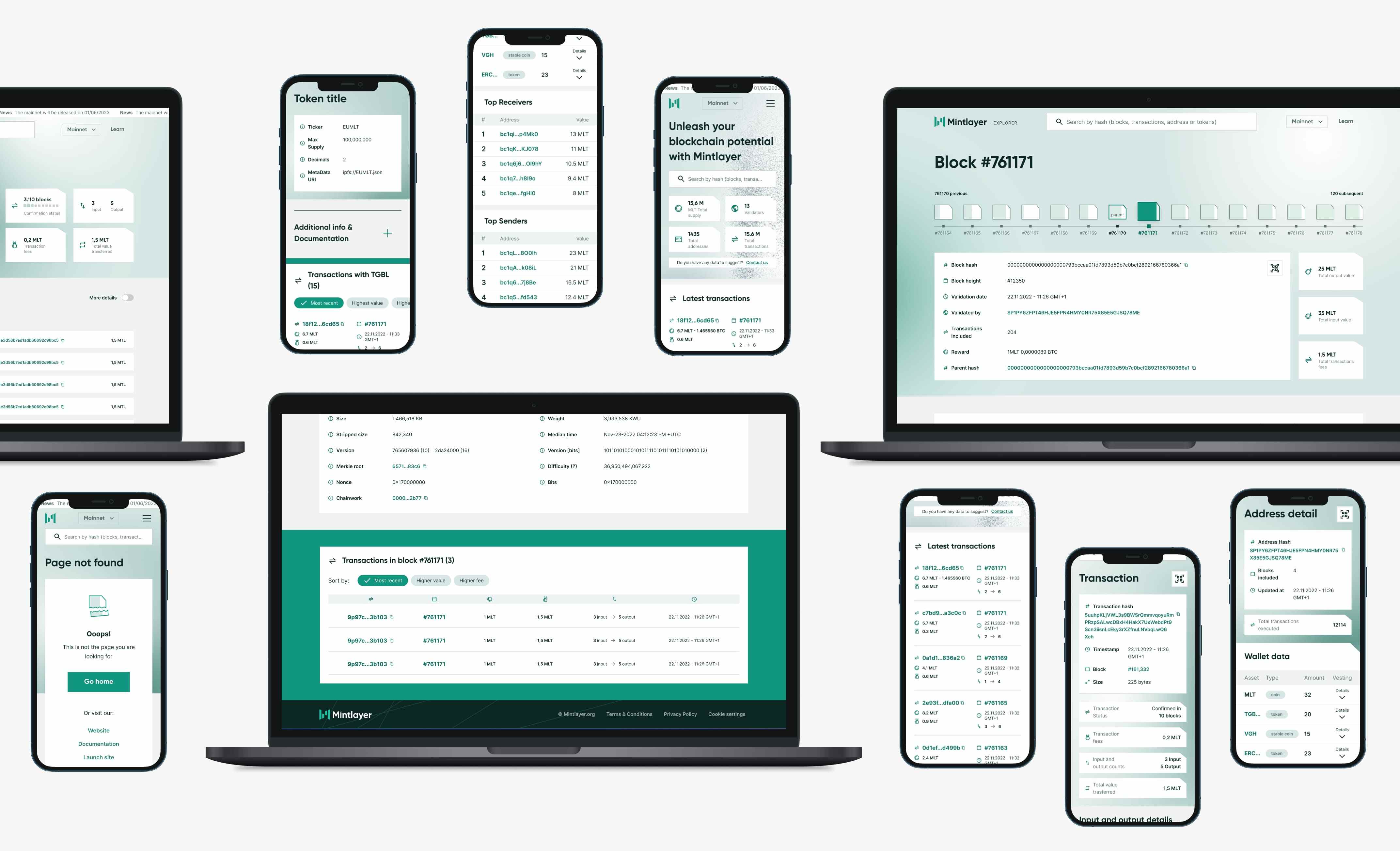
A few months ago, we had the opportunity to work with Mintlayer, an innovative company in the blockchain industry that aims to revolutionise the way cryptocurrencies are created and managed. To achieve this macro-goal, in a field mined with daily scams, the company Mintlayer had the need to create an accessible, intuitive and easy-to-use block explorer, to start testing and delivering tokens, building the largest possible user base.
Furthermore, the client perceived the need to redefine visual guidelines and create a design system for the entire range of his digital products. Thanks to the approach adopted and the extremely effective collaboration put in place, we were able to design together a functional and accessible block explorer.
To support Mintlayer in the short-term expansion of their user base and accordingly respond to the needs not only of the business but of their users, prioritising the needs of the less experienced ones, known as "retail users":
- We analysed their needs to understand which features and data would meet them and thus create a backlog of prioritised functionalities.
- We defined in detail the type and quantity of content actually needed to be shown, without excluding data and information useful even to experts.
- We studied a visual hierarchy of data, implementing systems to simplify their reading.
- We identified visual guidelines, personality, tone of voice, and everything that characterises the Mintlayer brand.
- We applied this analysis to the creation of the Design System that can be used across the entire range of products and that we used in the creation of their block explorer.
- We conducted a series of user testing sessions, with an interactive prototype, to validate or revise design choices, in order to achieve an optimal result.
- We made design decisions based on accessibility principles, in order to lower the barriers to using the tool as much as possible.
Working together with Tangible gave us the feeling of always having the project under control (on time and on budget). We updated the budget, roadmap, and scope together, with a constant feeling of being heard. Excellent quality of visual assets and advice along the design journey from business idea to design. I look forward to being able to do a Mintlayer project together again.
Preliminary analysis: understanding Mintlayer and its architectural peculiarities
The amount of data that we have seen produced and cataloged by the Mintlayer team not only reflected a world that was distant to us, but was also vast and complex. Therefore, the first step to take was to comprehensively understand the specific data in the blockchain world, particularly in the Mintlayer ecosystem. After conducting an initial exploratory phase of the most relevant block explorers to date, the next immediate step was to analyse the data collected by their development team, which serves as the beating heart of the block explorer. This preliminary analysis was crucial for gaining a better understanding of the unique characteristics of the Mintlayer ecosystem and identifying key areas on which to focus our design efforts. Furthermore, it allowed us to acquire in-depth knowledge of the challenges and opportunities presented by Web3 and apply that knowledge to the design of the block explorer.
Brand workshop: defining the Mintlayer brand identity and redefining visual guidelines
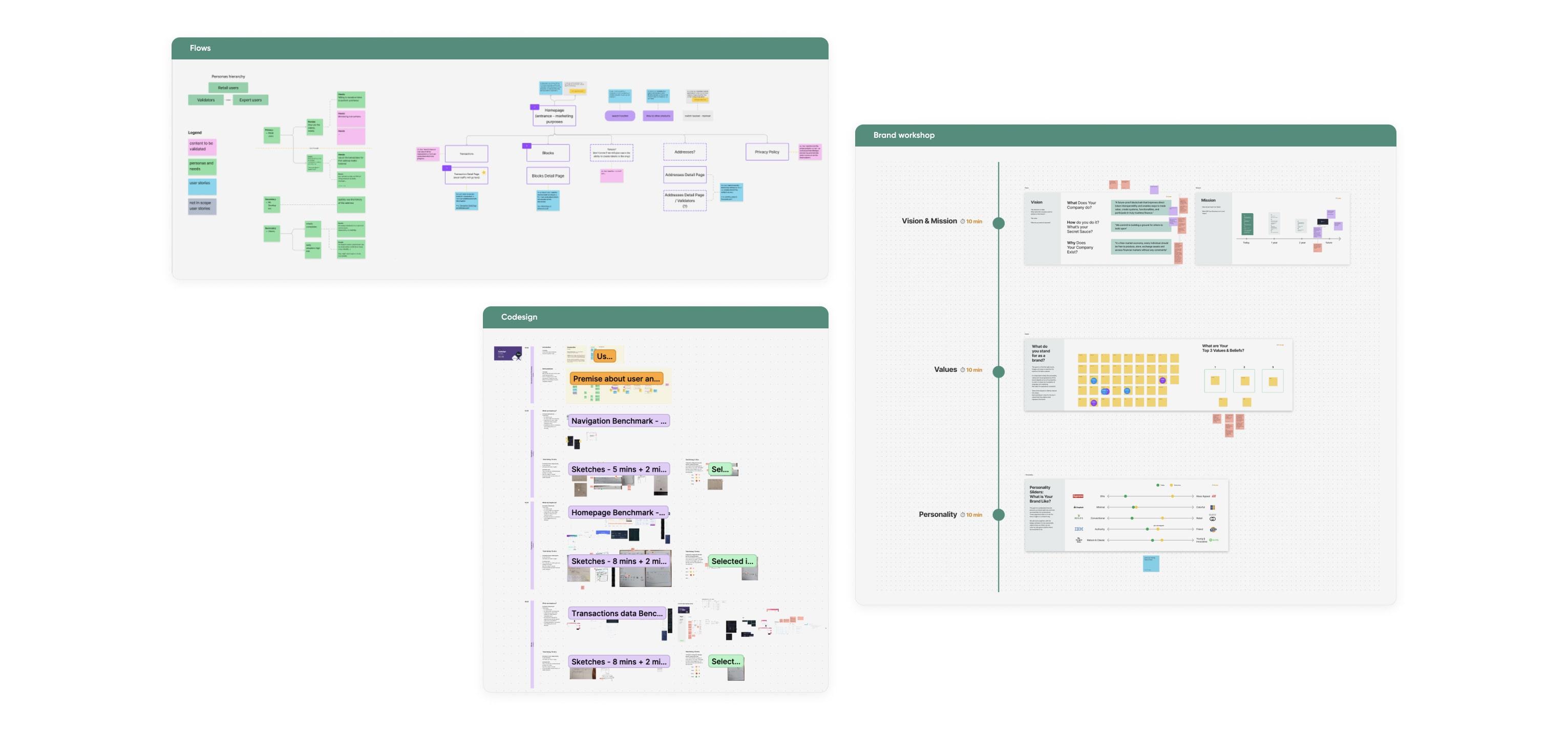
The brand workshop was a crucial moment in which we worked closely with the Mintlayer team to explore the brand's identity, discuss the company's core values, and redefine visual guidelines. We defined the personality, tone of voice, and values that characterise the Mintlayer brand to apply them to the creation of the Design System and their block explorer, as well as the entire range of products. The result led to the definition of features that reflect the innovation and courage that Mintlayer embodies, setting it apart from its competitors in the industry.
The importance of accessibility and responsible innovation
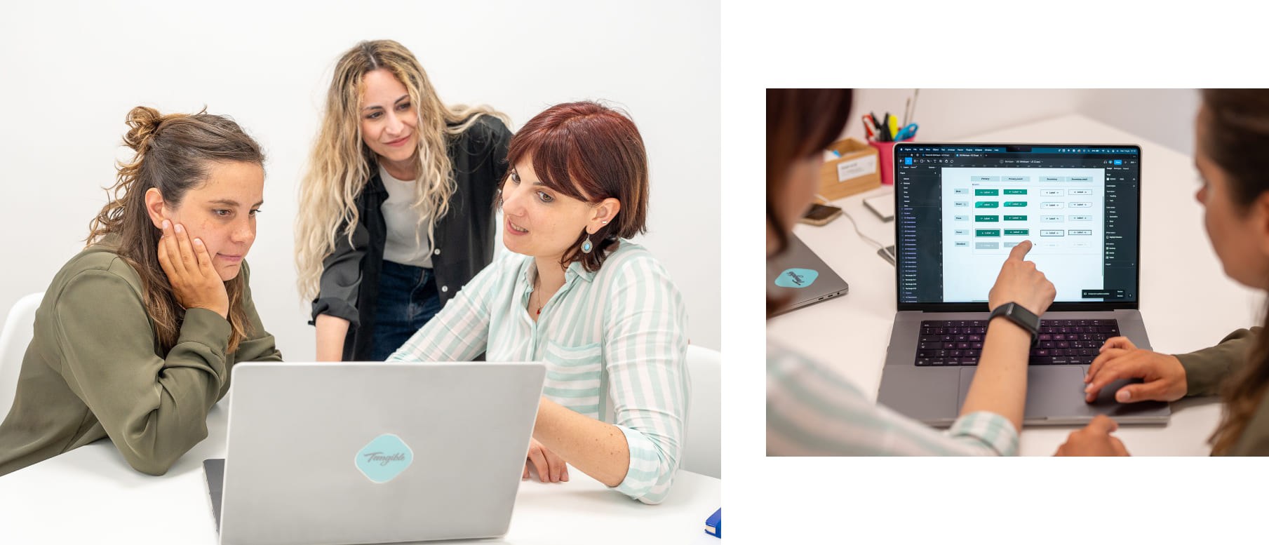
During the design of the block explorer, we paid special attention to accessibility by involving industry experts and following established guidelines to ensure a smooth and intuitive user experience.
Furthermore, in studying the brand, we discovered that Mintlayer's follower base on Telegram is far from insignificant. Wanting to validate our design choices with those who would actually use the block explorer, we immediately posed a question to the client: why not involve a growing community of users to make them feel part of the design process and strengthen their bond with the brand?
Before handing over all the relevant material for implementation to the client's development team, we sought consent from representative customers in the "retail" target group to participate in a user testing session. The organisation of this activity required significant effort, but it was proportional to its success. The new block explorer received excellent feedback from both the Mintlayer team and the user community.
Thanks to their participation, we confirmed some of the decisions made and modified those that required revision in order to fully meet the needs of users and, consequently, achieve the business objective of making the block explorer accessible to all, thus aiming to expand the brand's user base.

Global Collaboration: a united team despite distances and cultural differences
Overcoming the complication of different time zones through asynchronous exchanges and the use of tools like Figma and FigJam, we established a strong collaboration with the team and the Product Owner. Despite the inherent challenges of Web3 and the intercontinental distribution of the team, the adoption of collaborative practices, cooperation, and coordination among the various members led to the realisation of a product that meets the business needs and promotes responsible innovation.
Want more information about this project or would you like to discuss a similar project for your business?
