Thinking
Lessons Learned: Designing for Senior Users
We had the opportunity to design a digital experience that could simplify the daily lives of users over 65 and provide access to a wide range of dedicated services and features.
We developed the application with a user-centered design approach, focusing on the actual needs of end users and promoting the concept of active aging. In this context, our challenge was to create an experience that ensures straightforward access to services and activities related to health, wellness, and entertainment, in alignment with the needs and expectations of self-reliant people with varied technological skills, considering the natural aging processes both physically and cognitively.
To ensure the design phase took into account the potential needs of our target audience, we enlisted the expertise of Fondazione ASPHI Onlus, an organization we've previously collaborated with in various events and internal training sessions. They are dedicated to promoting a digital culture attentive to the needs of people with disabilities and the elderly in educational, work, and social contexts.
This collaboration provided invaluable insights to inform our design phase.
Considering the natural aging processes
When designing digital products or services for a specific target group like those over 65, it's vital to consider natural aging processes, which might involve physical and cognitive decline. These variables must be considered during the design phase, especially when designing a diverse experience essential for accessing dedicated services.
We identified three stages of the aging process:
- The individual is self-reliant and can interact with spaces and devices independently.
- The individual is frail, facing physical or cognitive challenges that can affect interaction.
- The individual is not self-reliant, requiring assistance from a family member or caregiver.
Based on this understanding, we focused on designing an experience accessible to users in the first two conditions.
Foundations for Informed Design
Two crucial questions guided our design:
"How can we make our design accessible to everyone?" and "Are the people we're designing for accustomed to using digital devices?"
These questions, combined with the insights from ASPHI, served as fundamental principles and lessons learned for designing services for similar target groups.
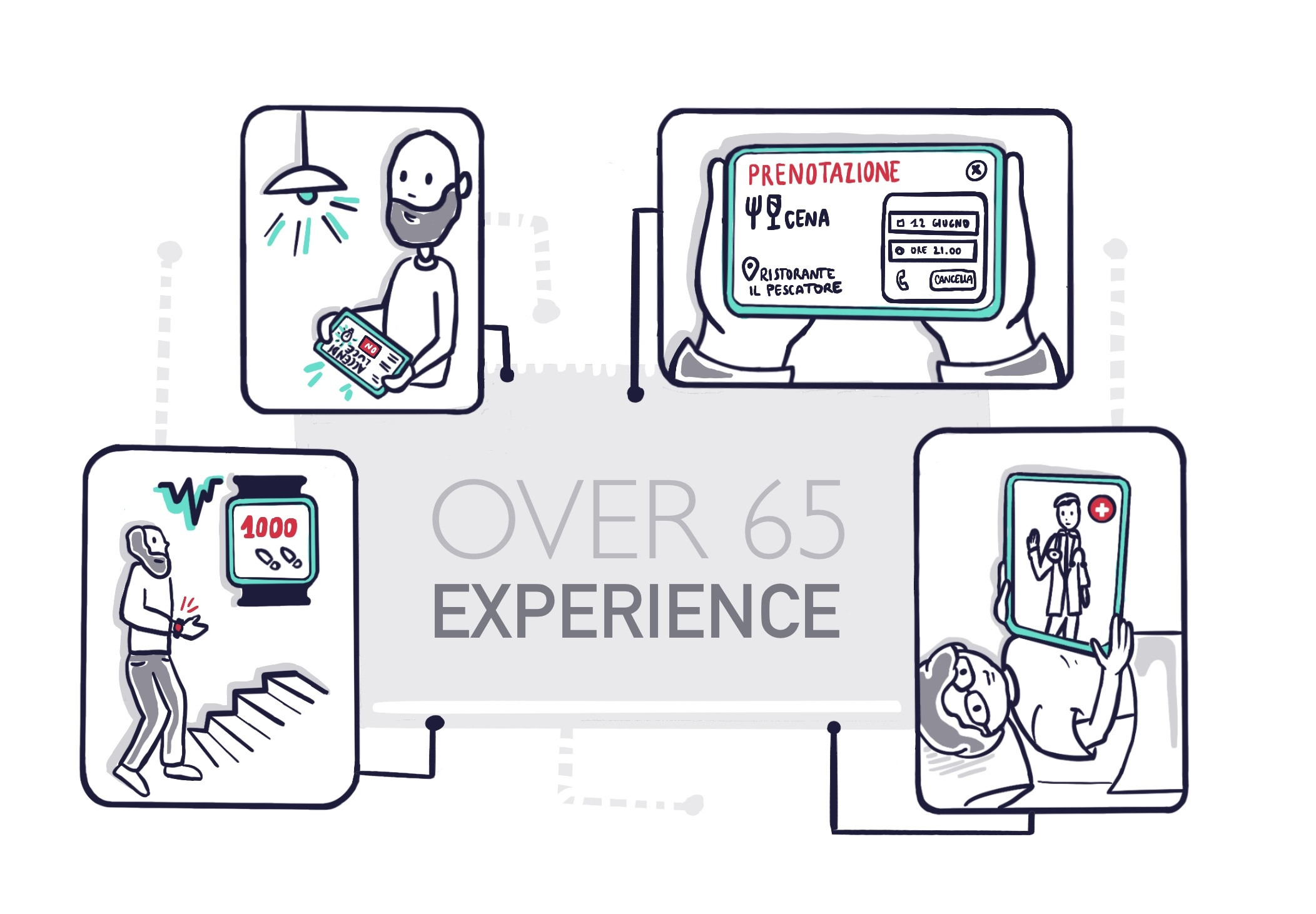
A guiding principle in our design was to make the "digital experience as close as possible to the real-world experience." We introduced familiar patterns to help users maintain their habits in the application, aiming to engage even those less familiar with digital devices and prevent app abandonment.
For instance, we designed a "calendar" feature to closely resemble a paper planner. Users can view appointments on the main dashboard and manually add weekly events, like birthdays or dinners. The only automation we included pertained to booking integrated services.
With the same aim in mind, we simplified flows by removing automatic cancellations, reduced data input fields, and promoted human interaction, allowing direct contact with service providers.
We paid close attention to language and utilized images, dashboards, and colors to simplify and make the design recognizable.
Another consideration was designing the application with gradual and incremental structure, ensuring simplicity and accessibility from the start.
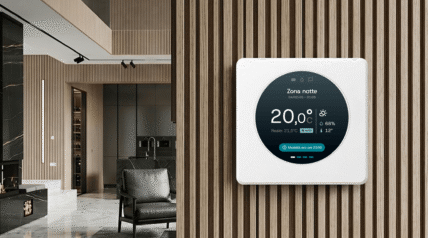
IoT (Wearables and Home Automation): Design Considerations for Seniors
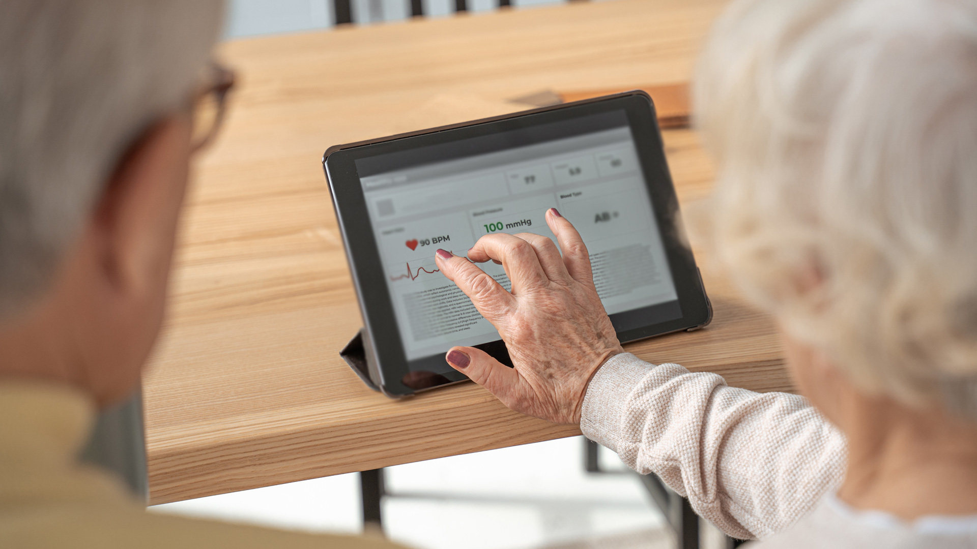
A significant portion of the app experience revolves around reading and visually interpreting information from wearables and smart home devices.
The wearable interface aims to make health monitoring effortless, tracking daily activities, rest hours, and one's psycho-physical condition. During the design phase, we prioritized easy data interpretation, emphasizing the information without highlighting potential deteriorations due to aging. This approach ensures users don't perceive data as diagnostic or evaluative.
Attention to copywriting and how data and associated advice are communicated is crucial. Every piece of information serves as a suggestion, avoiding any alarms or impositions.
Both the wearable and app should support the user and not pose barriers. Key considerations we applied include:
- Providing easy-to-read yet detailed information, giving users a comprehensive overview without a steep learning curve.
- Using colors for quick insights, which can be further examined independently or with professional help.
For home automation interface design, we adhered to some of the above principles, using a main dashboard to avoid overwhelming users with information.
Other design highlights include:
- Scenario Creation: Allowing users to change settings across multiple devices and associating these settings with different times or situations.
- Use of Imagery, Animations, and Icons: Offering direct insight into actions, such as showing the degree to which curtains or windows are open.
Beyond Lessons Learned
Our collaboration with ASPHI confirmed the importance of engaging external communities, especially when designing for unfamiliar user groups.
In "The Field Study Handbook", Jan Chipchase discusses the need for a "fixer" in qualitative research, especially in unfamiliar contexts. Originating from journalism, a fixer assists reporters in navigating and understanding local cultures. Likewise, designers need networks of such individuals to explore less familiar terrains, ensuring design principles are based on solid understandings and not mere assumptions.