Coop Alleanza 3.0
A website designed for growth.
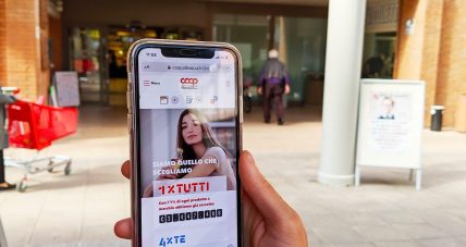
Achievements
>0,5M
Registered users
>5M
€ collected for social activities
+200%
Page views
+95%
Unique users
The client
Coop Alleanza 3.0 is the largest Italian consumers' co-operative belonging to Coop System. It has more than 430 points of sale located in 12 different Italian regions and 22 thousand coworkers. It was created in January 2016 by the merger of Coop Adriatica, Coop Consumatori Nordest, Coop Estense and the subsequent acquisition of Coop Eridana and Coop Sicilia. Its greatest value is the social base counting over 2.3 million members. Coop’s members represent the main user of all Co-operative’s sales and communication touchpoints: they lie at the heart of its governance structure.
Background and Context
Coop Alleanza 3.0 is a vast and varied entity and its digital presence is just as wide and complex.Since 2016, Tangible has been a supplier to Corporate Communications Department, which is responsible for all Cooperative’s external and internal communication, included its official website: www.coopalleanza3-0.it.
After the merger of three large cooperatives, namely Adriatica, Nordest and Estense, Coop Alleanza 3.0 became the largest Coop Italia’s organisation.Over 50 years of different cooperative activities came together in a single new narrative. A new cohesive voice had to be created, to reach new customers and strengthen the relationship between members and historical customers.It is precisely from this interweaving that the name of CoopAlleanza3-0.it website project was born: Relazione 3.0 (Relationship 3.0).
All distinctive features of the only Italian large-scale retail trade, made by its members and for its members, had to find a place within the project. It was necessary to include a multitude of personalized services, such as social projects and products offers displayed on shelves or collected in flyers (different for each store). Furthermore, we had to give voice to the “penny-wise soul” residing in the Shareholder loan. It was a real challenge.
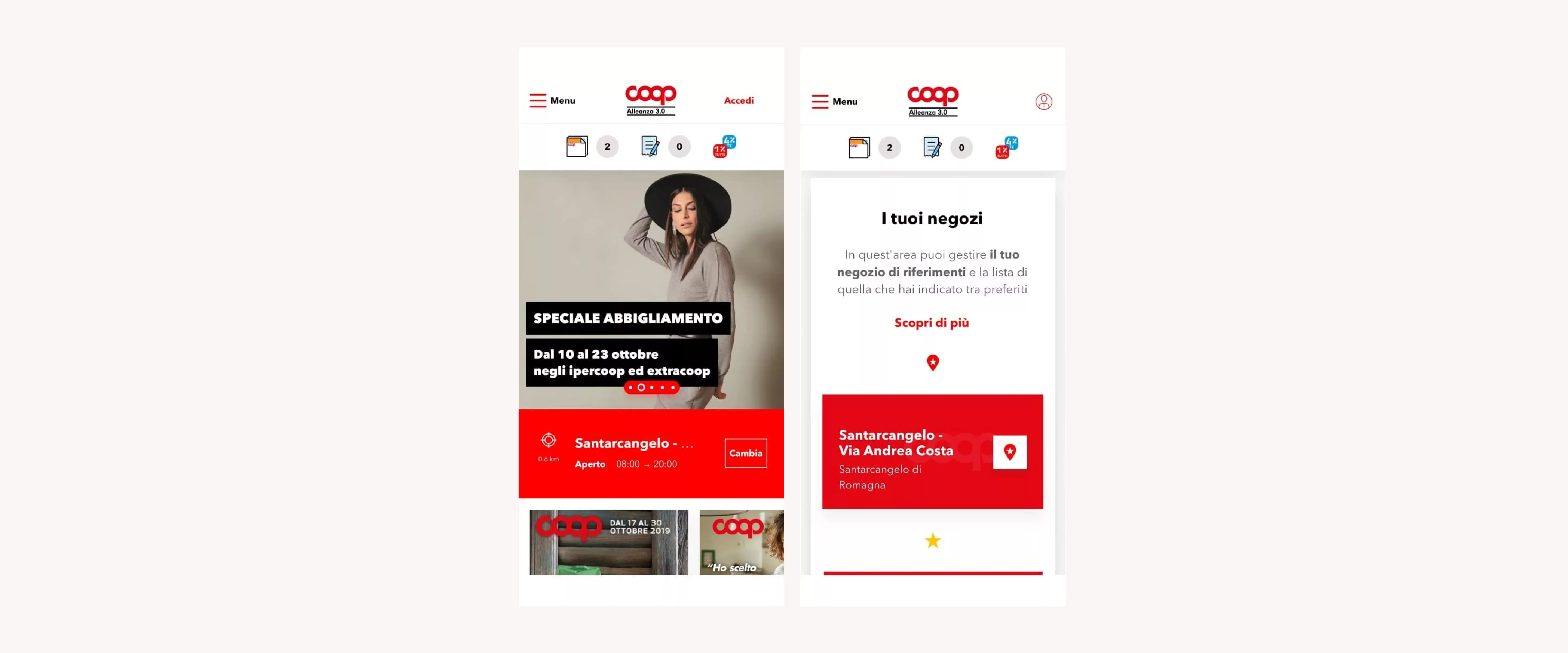
A website designed for growth
Ideally, websites and digital tools should be designed in the light of future developments. However, how many of them really meet this expectation? How many can withstand and support different suppliers working simultaneously on different areas, while maintaining consistency? How many of them can actually support development rather than require interventions on pre-existing materials?
After almost 3 years of work, we can say that CoopAlleanza3.0.it has managed to keep this promise. We had the opportunity to test, repeat and improve some sections. In addition to it, we designed new one and grafted them on the original structure, which over time proved to be a solid starting point. Just like the structure, the visual system improved and became a shared alphabet not only for Tangible, but for other 5 suppliers working on the website and other touchpoints with complementary roles and skills.
Not only visual rules: an extensive documentation on flows, funnels and navigation within the sections has allowed us to release content and publish numerous features that have brought the website alive. This process generated general guidelines able to optimize daily workflow.
This valuable pool of information has enabled a rapid internal and external onboarding process and scheduled team switches, without affecting quality and values delivered to the customer.We have managed to involve about 10 people in 3 years, who have been able to improve their skills in the retail sector. At the same time, they brought experience and best practices acquired in other areas into play.
Here is how we made that happen.
Design Vision: study and plan an yearslong process
To create a solid basis for our design, we started from a design vision phase. The goal was to fully understand the ecosystem on which the website would be placed and which should have become the main channel for all web communications.
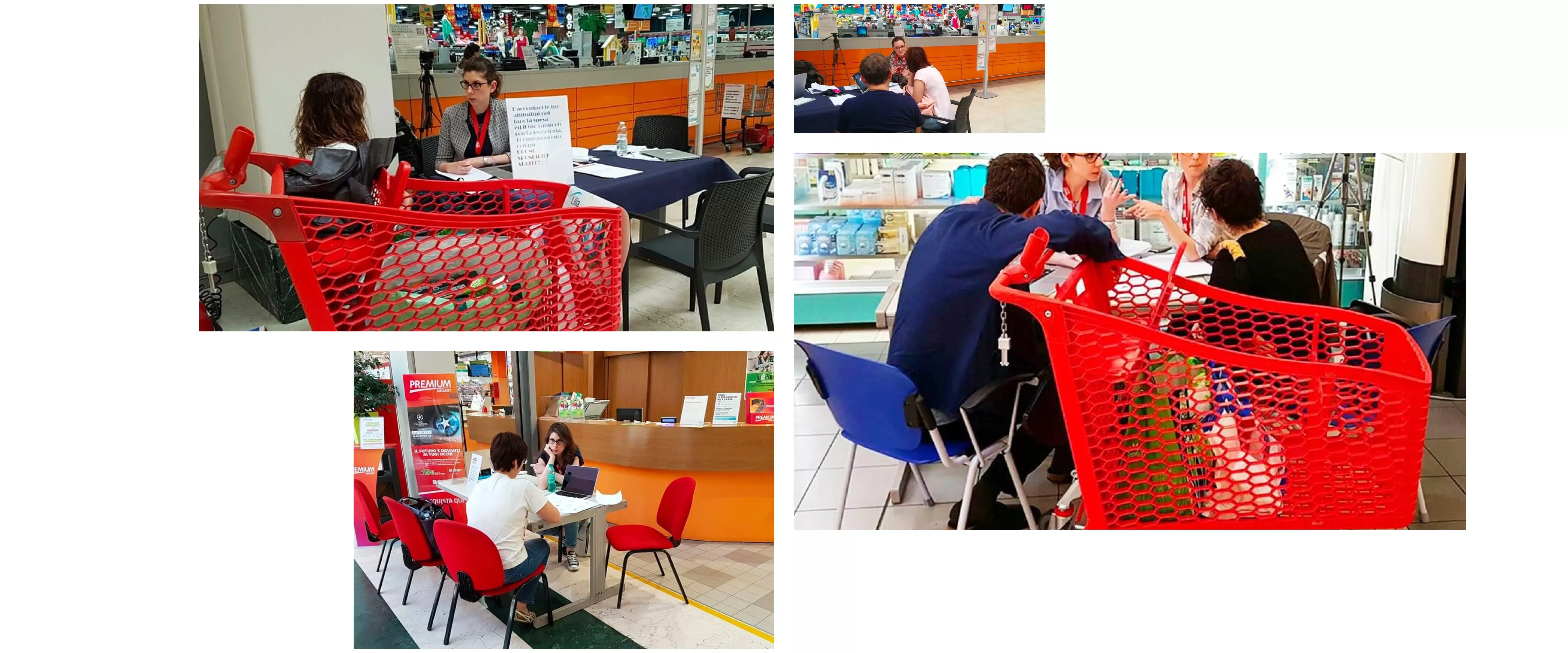
The hypothesis that emerged were verified during an extensive exploratory research session conducted with users. We interviewed customers and partners, visiting stores from north to south along the Adriatic ridge. We investigated their motivations, needs and especially which reasons led them to choose Coop. We asked what services were representing the strongest benefits and what were the gaps that had to be filled. Above all, we asked how could the website become a useful touchpoint and improve shopping processes. However, talking to people who are very familiar with the brand was not enough. Therefore, we interviewed customers of other retailers, to understand what are the main reasons of those who do not choose Coop and what could encourage them to change their preferences and shopping habits.
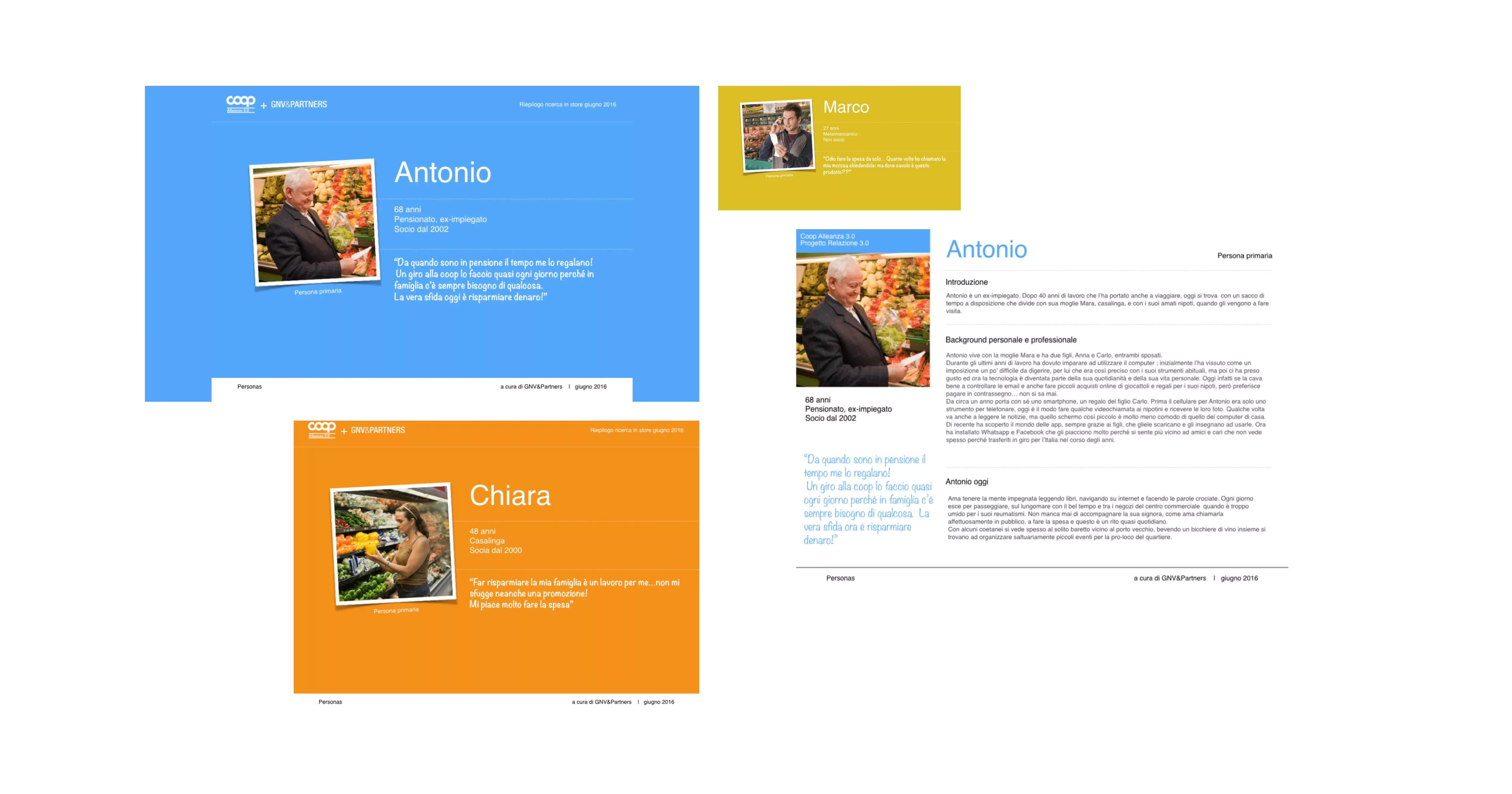
After gathering information from over 100 qualitative interviews, we were able to draw accurate user profiles and summarize them into 5 personas. These “archetypes” proved to be very a useful tool, able to guide decision-making processes. In fact, not only the design team, but also Coop stakeholders refers to them to decide upon new project communication.
Lean Design: grow the idea by designing and testing
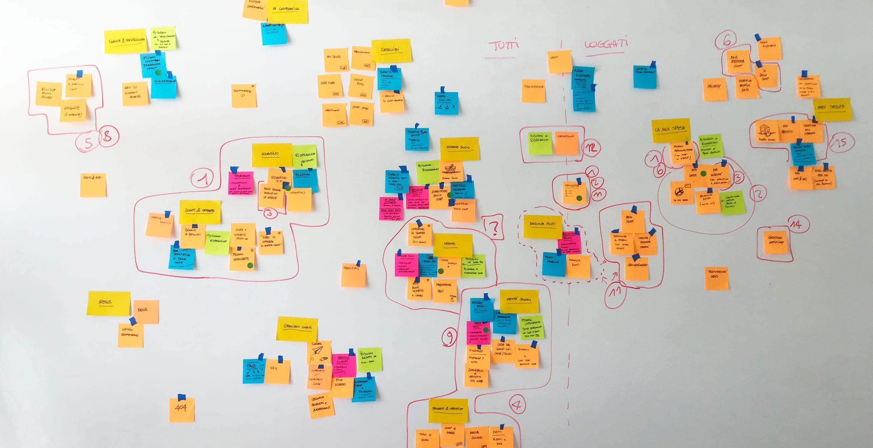
To start the lean design phase, we involved a group of partners in the planning process. To identify the most relevant content, we guided members through a series of facilitated and thought-through exercises. This focus group, structured to represent a validation of the maxi exploratory research, led us to build the information architecture and navigation structure of CoopAlleanza3-0.it.
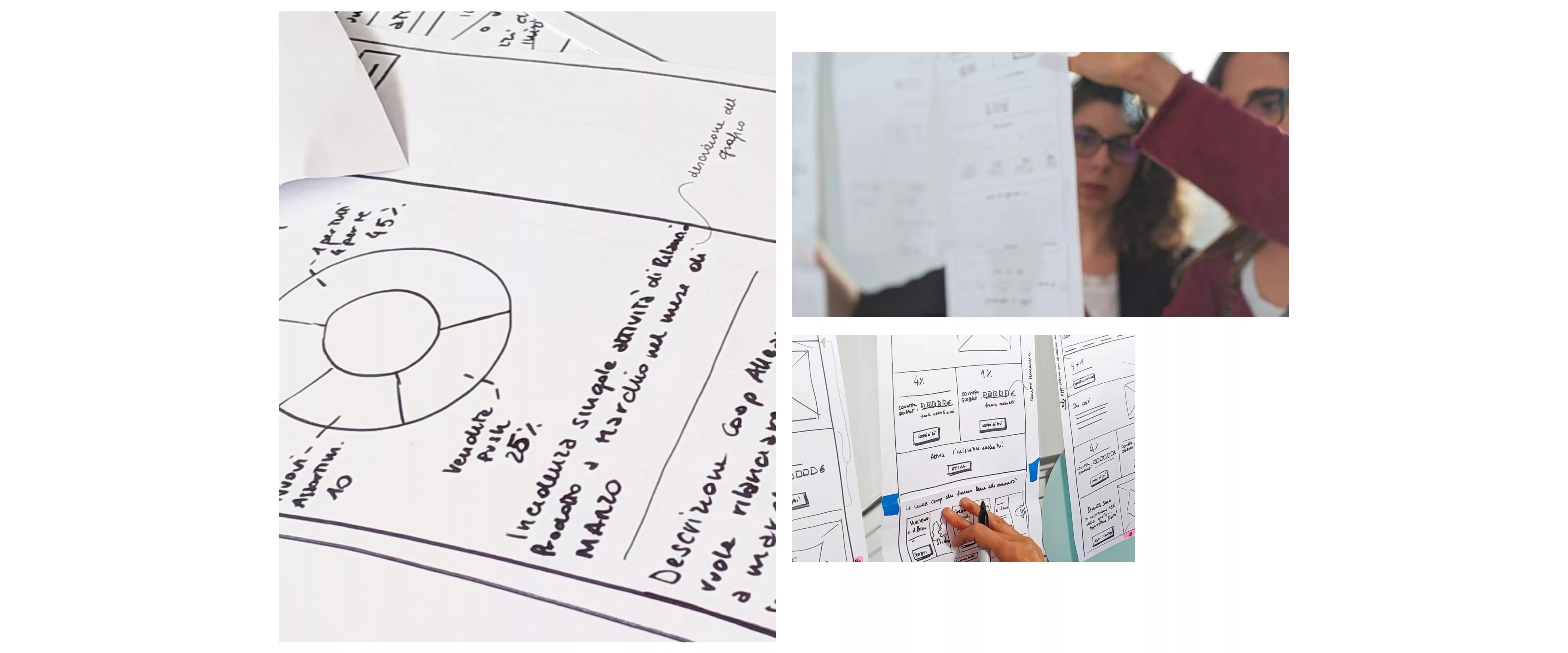
After clarifying priorities and mapping content, we proceeded with designing different sections. By creating prototypes, first sketched on paper and then, increasingly more similar to the actual outcome, we helped the working group, made of different Coop managers, to make important decisions. By submitting prototypes we helped them understand and approve flows, page structure, connections between content and every single step made for the actual website production.
Wireframes were quickly sketched on paper and then evolved into increasingly detailed and precise views. They supported the dialogue between developers, IT managers, suppliers and Coop’s stakeholders. These groups were working together on necessary activities on the CMS, that would allow the technical management of a complex touchpoint.
The increasing outputs grain has gradually led to the creation of a modular and scalable visual system able to rationalize content, by creating a versatile and extremely orderly blocks system.In addition to the modules, we have designed a series of page templates in which they could perfectly fit, ensuring good performances and ergonomics while scaling to adapt to different viewports and especially to mobile devices view. Thanks to the atomic approach we created the modular organization and generated consistent templates. This process fully met customer's need to manage the CMS independently and offered a solid structure for content publication. During 3 years of work, we have developed a components inventory and created an actual design system, which has become the source to which we draw from every time we have to design a new website section.
Design system: creation of the visual system
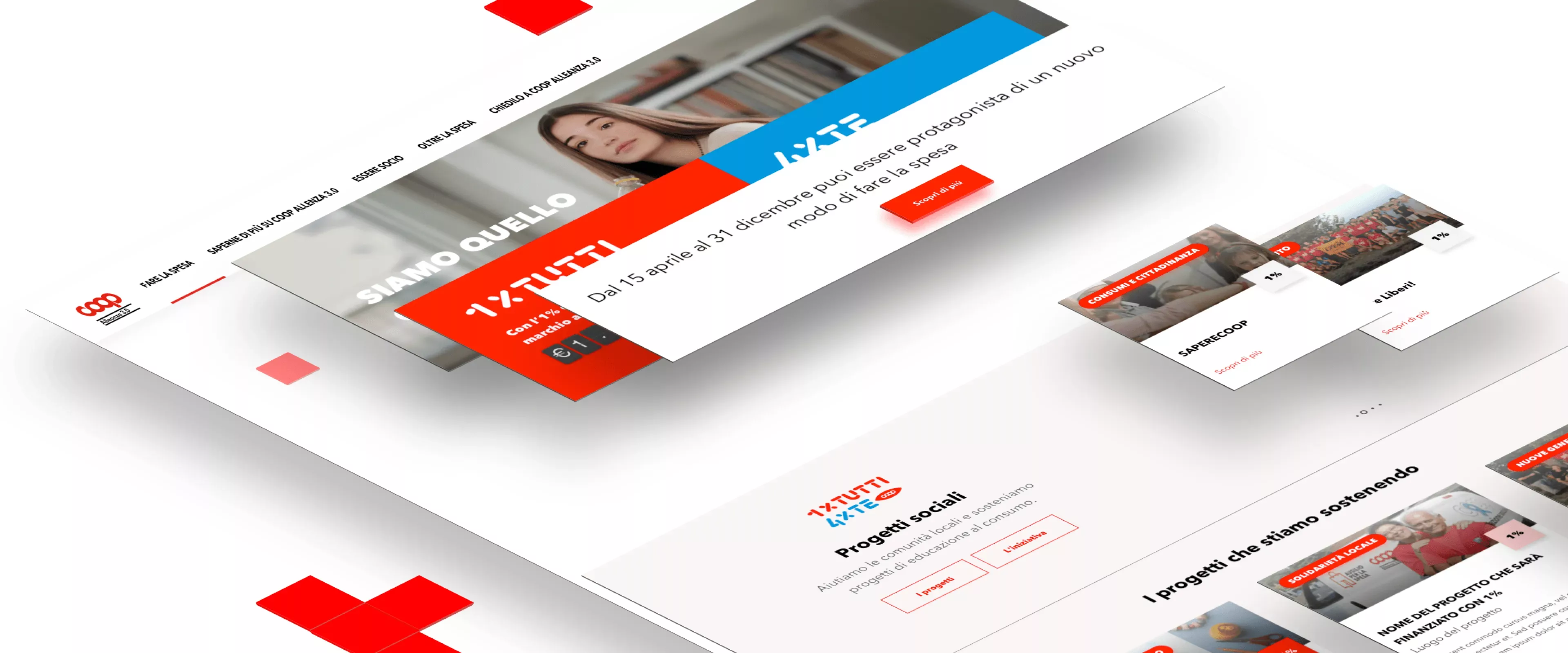
Coop website, multi-environment consistency: competitions, meetings, flyers and shareholders’ loan.
Using an atomic and consistent approach allowed us to create a persistent and spendable visual solidity, able to fit different circumstances and various experiences within the website.
Such a design system proved to be complete and usable in several contexts, as many as the areas of of Coop Alleanza 3.0 presence are. It ensured visual language continuity and consistency, not only for the Cooperative itself, but also for designers and developers who took part to the project: an efficient way to build a clear and recognizable web-presence for Coop Alleanza 3.0.
Brand continuity and coherence
Look and Feel
Coop Alleanza 3.0 is a well-known and recognizable brand. In such a large and widespread organisation, it was crucial to maintain brand values and history. We had to make sure that its digital instance would actually inherit the same strength and authority. While building the visual system we had to take into account a pre-existing fragmentation of its web communication. Before the merger, it was dotted with dozens of different websites and domains generated over time by different cooperatives. Due to the absence of a shared plan and a uniform style, the iconographic language and the general appearance of each website was disconnected. The creation of a new website was an opportunity to start working on this critical communication aspect of Coop Alleanza 3.0.
After studying the official brand manual and working in synergy with the agency for promotional and editorial communications, we created new visual guidelines both for the website and for the digital ecosystem.
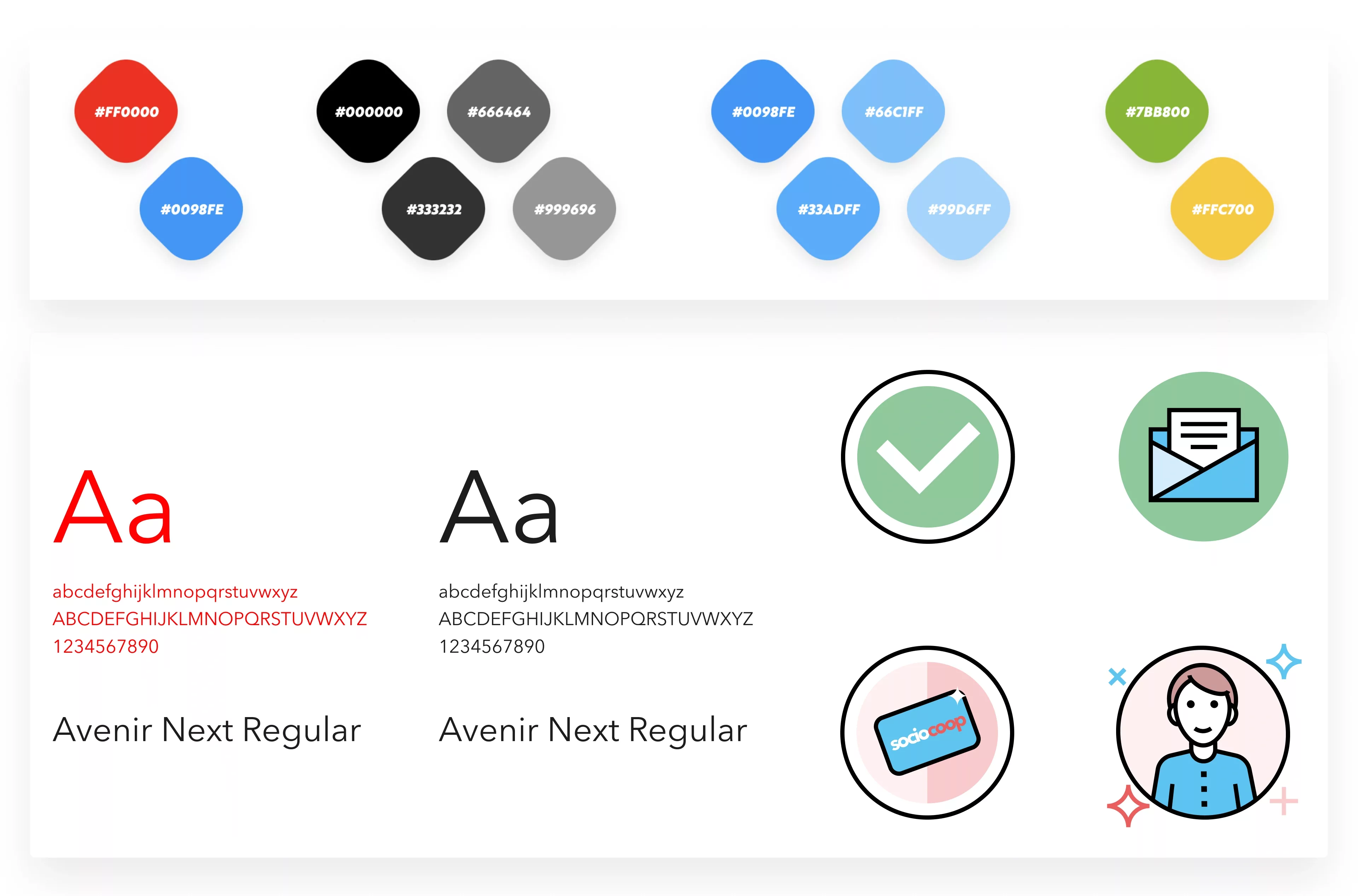
The result is a rational and clean style, that uses a great contrast between content and neutral space, with a solid sans-serif typography able to respect the brand identity guidelines.The colour palette shows the prominence of white, black and Coop’s iconic red, while blue, used in every touchpoint, represents its members. Each element contributes to the non-verbal transmission of the Cooperative’s values, such as solidity, clarity and transparency.
To fulfil the requirements of prominence, legibility and hierarchical clarity of a website rich of textual content, we have studied in detail typography and font weight rhythm, always taking into account to the role they play within the webpage. Texts care is especially important for the ergonomic usage of a website that must be able to provide information to anyone who needs to go shopping, included people with visual impairment.
Color palette
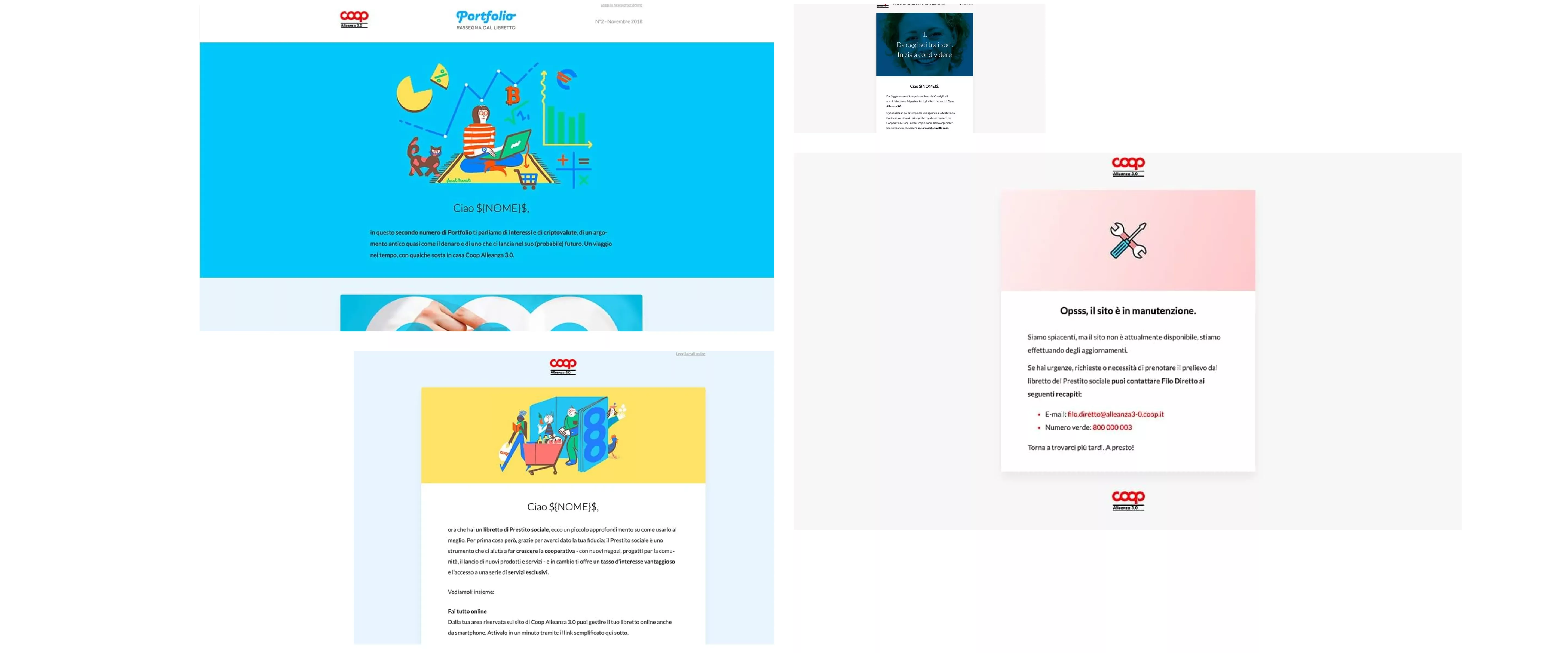
Newsletter
Dematerialization: digitization for greater transparency and ease of use
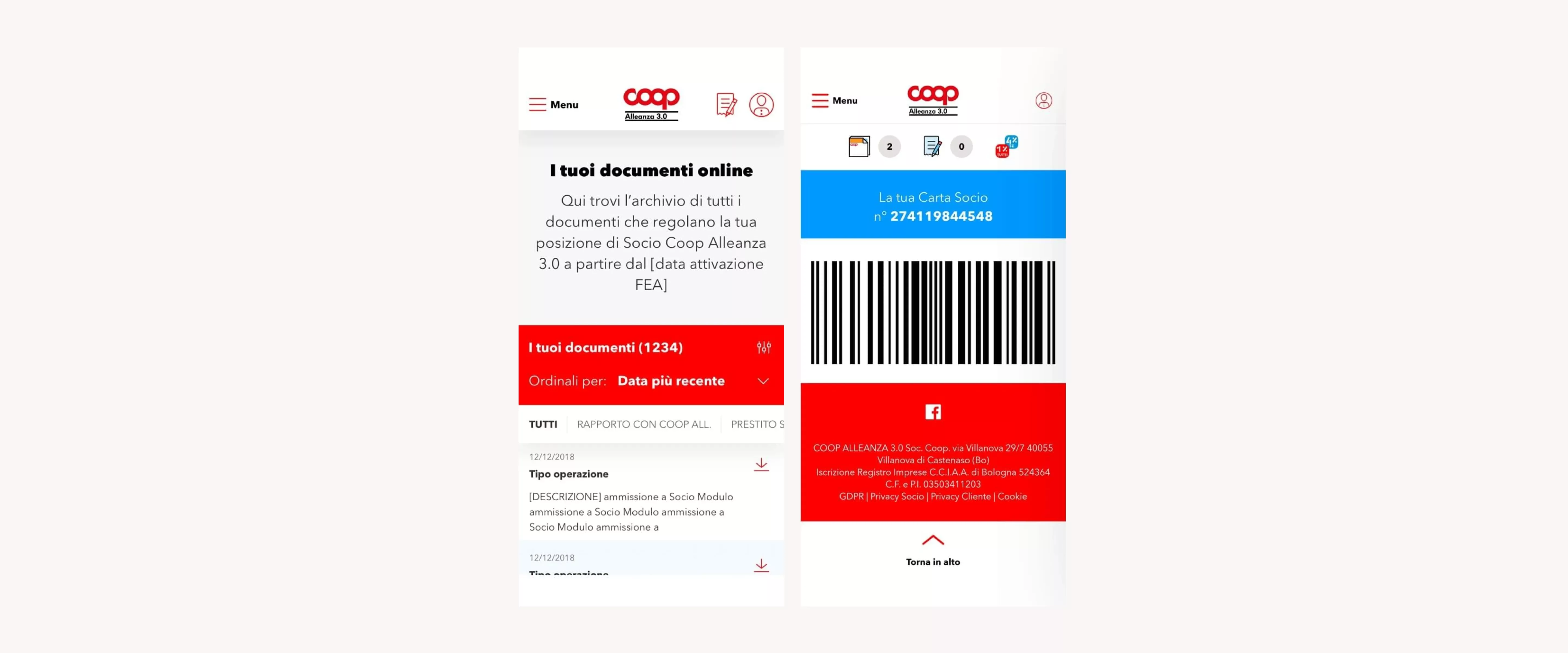
We have carried out two dematerialisation projects together with client and suppliers. By adopting a strategy that is compatible with the Cooperative's complex ecosystem, we succeeded in the dematerialisation of membership card and the AdES.
How many times do we roll our eyes up while checkin out, rummaging everywhere, to finally realize we have left our Membership Card at home? A thousand times.It goes without saying it, that when it comes to membership cards, there is an evident user need. We provided a digitized version of the EAN code, accessible from the dedicated area, usable at almost every checkout in each store.
Within the website, we have designed a dedicated AdES (advanced electronic signature) section, where registered members can access their documents. In order to facilitate the use of the archive, we have structured an easy flow of registration to the website. The procedure starts with data request belonging to the physical world and ends in the digital one.
Service design for a consistent experience
Opera tua and Io Sì: experimenting relationship between physical and digital worlds
The two projects belong to social commitment of coop. Opera Tua is dedicated to the support of art while IO Sì addressed to the protection of water.These two initiatives represented for us the first cases of design in which we had to design an experience that included payment operations at the cash desk (made with coupons, loyalty points, cash or credit card) and had to take into account the interaction between cash desk operator and customer.
Opera tua is now in its third edition and IO Sì is about to see its second edition: for both of them the participation format has changed. Thanks to their modularity, the structure of dedicated pages have been to be able to adapt to strategic and commercial needs.Today, both projects belong to 1 per tutti e 4 per te (1 for all 4 for you).
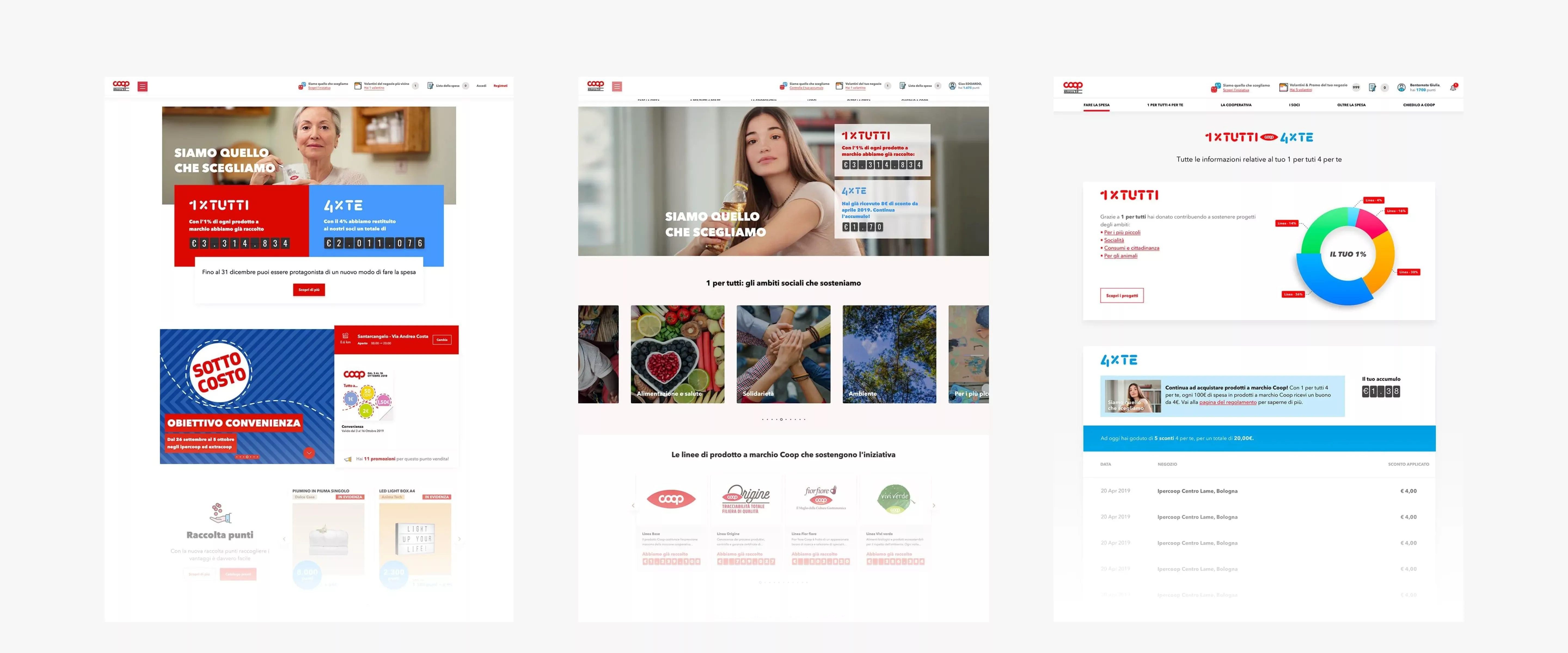
1 per tutti 4 per te: shaping your shopping habits. Complex experiences made simple and memorable.
1 per tutti e 4 per te is perhaps the most important initiative since the foundation of Coop Alleanza 3.0. Certainly, it was the most challenging of the last 3 years for our team.
First of all, the project had to move from the physical world to the digital world. This engaging and ambitious experience uses a 4% discount as a form of pay back for Coop branded products. Furthermore, the project provides benefits for the community: 1% of the income is set aside and reinvested in social initiatives. This not only creates awareness but reshapes people's spending habits.
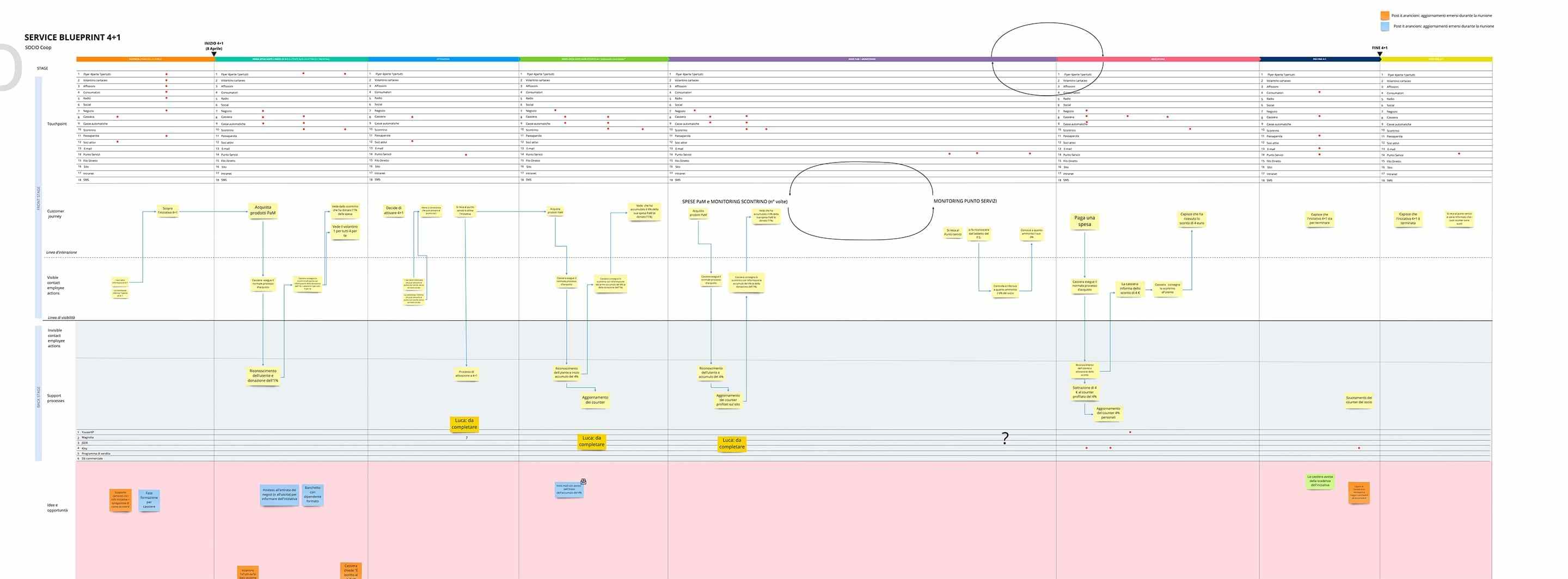
This initiative has involved all Cooperative touchpoints and the website played a central role both in terms of communication and operation. For this reason, we implemented service-design processes and techniques.
Digital Transformation: developing rather than replacing.
Social Loan:grafting the financial paradigm onto a large-scale retail cooperative website
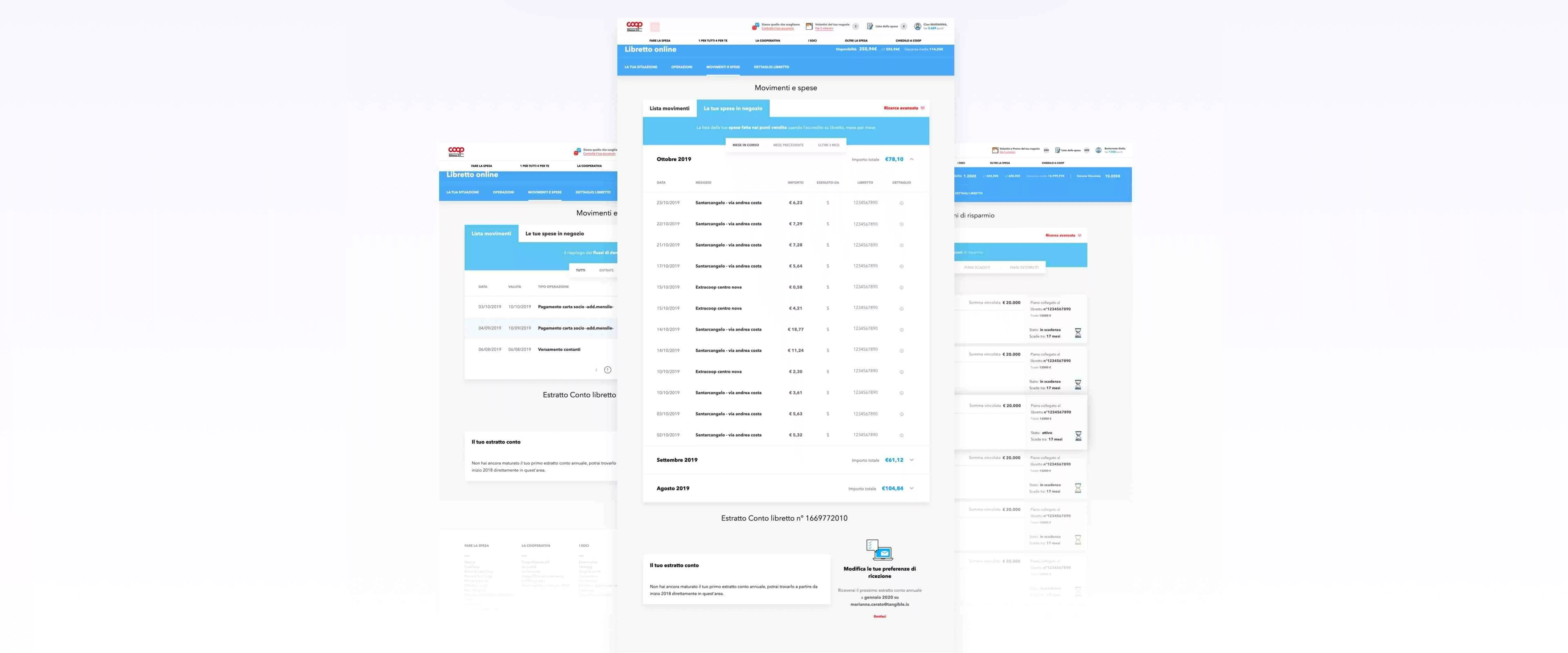
The shareholders' loan is a tool for investments reserved to cooperative members that aims at supporting its specific activities.Since its creation, every movement and operation on the savings account has been recorded on paper: using the passbook.For decades, the entire experience of lending members has been carried out through the intermediation of staff behind the counter or by consulting lines printed on the passbook. Although this feature is very reassuring for old generations, it represents a strong limit to acquire new generations lenders, accustomed to digital services in comparable contexts.
Our goal was to transform shareholders' loan into a digital service, so that members can benefit from it at any time, using their own device. Furthermore, by adding new functions we wanted to improve the user experience, whether they were using these tools to pay for their shopping in Coop Alleanza stores or simply keeping track of their savings.In order to understand different types of lending members journey, we applied service design criteria and generated ad hoc personas. This strategy has led us to create a dedicated section within the website: the Online passbook. Within this section, registered members can keep track of their movements and operations. Consulting the balance became easy and at your fingertips, just like checking loyalty points earned, verifying commitment to social projects or simply reading fliers.
The digital innovation process of the shareholders' loan is made of many different steps: first of all, it was necessary to enable movements and balance checking. This first step, has recorded high satisfaction rates among interviewed members that were asked to verify the usability through dedicated tests. Booking and planning withdrawals has been operational since the beginning of 2018 and we have in store a plan of new releases. The final goal is to create new functions to digitalise Lender’s processes, which makes counters operations less and less necessary.
To help the Cooperative decide where to actually direct innovation investments for the savings account, we have carried out an important two-phases research: the first phase, a qualitative one, was conducted by Tangible and the second phase, the quantitative one, was carried out by Doxa under our coordination. The two phases proved to be complementary and supportive of each other: the results gave relevance to what emerged from the interviews. Furthermore, user’s insights enabled the analyst to read numbers with more clarity and knowledge of the facts.
A big step forward has already been taken in a matter of simplification, increased security and optimization of Cooperative/Member communications. However, we still have to make many steps ahead on the path of designing. The entire process, meant to match verified data and business strategy, will enable a transformation aimed at developing - instead of replacing - a product that has long existed in the physical world. The core of this development lies precisely in providing the product with a consistent digital experience.
Project team

Edoardo Sportelli
Interface Designer

Paolo Valzania
Icon & Illustration Designer


