è-coop
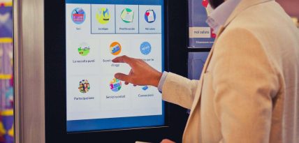
A breakthrough concept for the new digital touchpoints placed in a dedicated space inside the store.
Achievements
4 months
from the idea to the installation in stores
The client
Coop Adriatica is one of the nine big cooperatives being part of the Coop system, Italy’s most important large retailers chain and, at the same time, the biggest italian consumer cooperative. At the end of 2014, the property is shared among 1.330.477 Members. In 2016, Coop Adriatica, Coop Estense and Coop Nord-Est are joining forces and becoming Coop Alleanza 3.0, counting 2.700.000 Members.
Visit website: lucegas.coopalleanza3-0.it
Making Coop Adriatica services visible and attracting to generate leads
Summer 2014: “Can we sell our services the same way we sell the products displayed on the shelves of our points of sales? How can we give visibility to the many services we offer to our Members and Customers? How can we simplify their customer experience?”.
To answer these questions, Coop Adriatica assigns to INRES the design of the possible architectural solutions, adjusting the spaces inside the points of sale. After a few weeks of work, the circumstances evolve and the italian Energy&Gas market starts changing. What up until then seemed to be only a hypothesis needed to turn into a precise idea with a clear deadline: starting from September 2015 (it is the beginning of the period of the co-existence of the protected market with the new-born free market) Coop Adriatica Energy&Gas offer must be found also inside the new spaces provided by the points of sale. In addition to Energy&Gas, Coop Adriatica takes this opportunity to show one more service (Noi Salute) and two main services (Becoming a Member and Social Loan).
In the space designed by INRES, Coop Adriatica Customers and Members can easily walk by with their shopping carts and take a seat, recharge their phones or tablets, independently find information about Coop Adriatica services by browsing the content in the touch-screens, ask for more information and sign contracts with the help of a staff member. To build such space and such digital content, Coop Adriatica assigns Marisa Pecere and Paolo Fioravanti to coordinate a team in which the managers of the Systems and Development (Andrea Furegon and Francesco Soda) and Communication (Lina Sini and Biljana Prijic) areas, Andrea Gabrielli, Product and Service Innovation Manager, and Franco Pacino, Category Manager, can work together with a few selected partners. At the end of March 2015, internal and external teams are defined and tasks are assigned: we will be in charge of user interaction design of the touch-screens incorporated in the main columns, Reply will be in charge of the development of the technological infrastructure, INRES will build the architectural space, Kitchen and Open Group will be in charge of the space awareness defining a brand and its communication by a series of spot broadcasted from the televisions placed outside the columns. Gianluca Diegoli will be the marketing mentor.
The first go-live is scheduled for the beginning of September 2015, in the hypermarket in Chioggia. The second go-live is planned for the end of November 2015, in the hypermarket in Rimini. For this release, Coop Adriatica will introduce the Social Loan self-service machine to allow lenders to perform operations related to their savings booklet.
"As a planning manager, I am used to think about the key people and their ability to bring value to a communication project from the beginning. I did believe that an accurate analysis of the user experience would have been essential for our ecosystem of services and this opportunity would have been good to involve GNV & Partners, that I knew for their reputation: though, working together has gone beyond all my expectations, in terms of value created for our Members, for our Cooperative and for the competences we all have gained.The best “supplier” (or - better - call it “partner”) is the one from whom you can learn something new every day we work together."
Context and time
From an ergonomic point of view, designing interfaces for a 32 inches touch-screen is a challenge in itself. However the biggest challenge of the project has been designing for the experiences deeply understanding both the contexts and the moments implied in such places. These aspects have had a particular weight in all the decisions we suggested about information architecture, flows, interactions, contents and readability.ècoop touch-screen are placed in a hypermarket, therefore we must take into account that this is a public environment and that users will make an occasional use of the touch screens, while they are there mainly to do their weekly or daily grocery shopping. Consequently, people using these particular touch-screens, in this particular context, will have a very short time to learn what they can do and a very low focus. What are the implications suggested by these touchpoints and by the hypothesized digital and physical call-to-actions? Do they imply (or demand) any change of habits related to the “shopping” time?
From the concept, to the prototype, to the product
Our design process helps opportunities and findings emerge, it makes them visible and allows people debating about possible solutions, that in this case would have had an impact on the overall service. This is the reason why we share our roadmap and involve all teams in all the phases of our process.
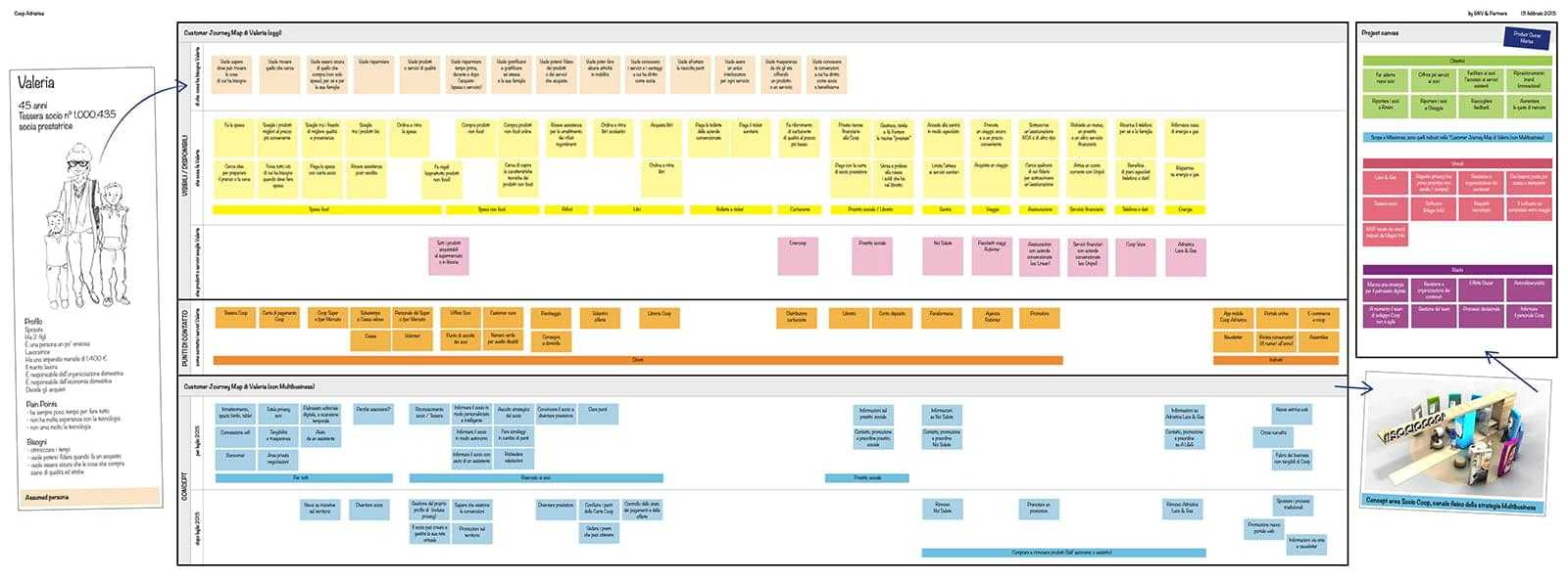
Discover
Inspections of the points of sale
We carried out inspections in two stores (big and medium size). We grabbed the opportunity to talk to store managers (all males) and staff members (all females).We found out a few dynamics and habits that were very different from each other: what for the staff was absolutely obvious was unknown or marginal for the teams working in the project.
Interviews and Tests with Customers and Members
We set up 2 days of interviews with Customers and Members, intercepting them inside the hypermarket of Rimini. For these sessions, we sketched a lot of hypothesis of the interfaces to test experience, ergonomic and usability issues, then we prepared a prototype of the physical kiosk using thick styrofoam. By pointing out our sketches attached to the styrofoam, Customers and Members helped us understand what are their habits and their needs (savings, safety, privacy, time and hurry, payment methods, rating of their reward cards in the receipts, the Member Point, the Social Loan…).Testing by using paper and styrofoam allowed us to ask tangible questions and collect very precious feedback. Customers and Members had shown us what were their expectations about the content in the touch-screens, what they didn’t want to see there and what would have bothered them.
Interviews and tests with Active Members
We organized 3 focus groups with 3 groups of Active Members. For these sessions, we replaced our early sketches with a digital prototype and we projected it on the styrofoam. Again, during these sessions, by using our prototyped kiosk we helped Active Members understanding the subject of our questions and they were facilitated in describing their particular relationship with the cooperative and their initiatives.Their expectations were very different from the ones emerged during our previous sessions.


(Re)define
The discovery phase challenged a set of complex features that were initially planned. This happened because interviewees showed for them very low or no interest, if not inconvienence. This phase has also revealed new features that no one had imagined until then.We reopened and renegotiated the map of the project involving all the teams, redefining features and priorities. We designed a Journey Map to give evidence to the emerging touchpoints and call to actions, because originally they were meant to be inside ècoop space but interviewees had clearly showed us that they expected to find them somewhere else and in a different time of the day.Lastly, we generated a backlog of ideas to evaluate after the first go-live.
Visual Design
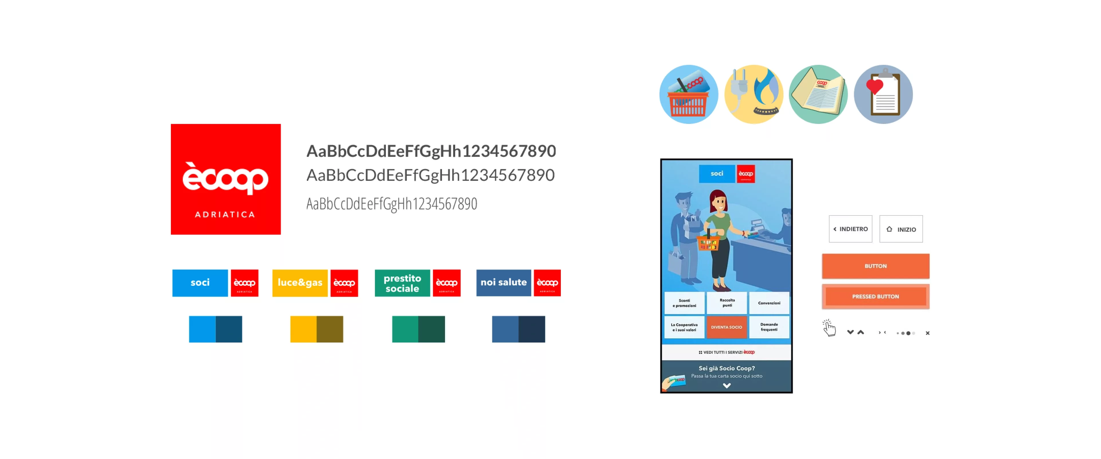
For this project, which was totally new for Coop Adriatica and for Coop in general, the decision has been to create a whole new brand identity, parallel to the Coop brand.Kitchen conceived the naming and the brand, designing the new ècoop identity and those of the four services, defining all color schemes.Together with Kitchen, we defined the ècoop typography system, in order to gain consistency between physical and digital touchpoints.Starting from these visual guidelines, our team designed the full digital identity for the ècoop brand.
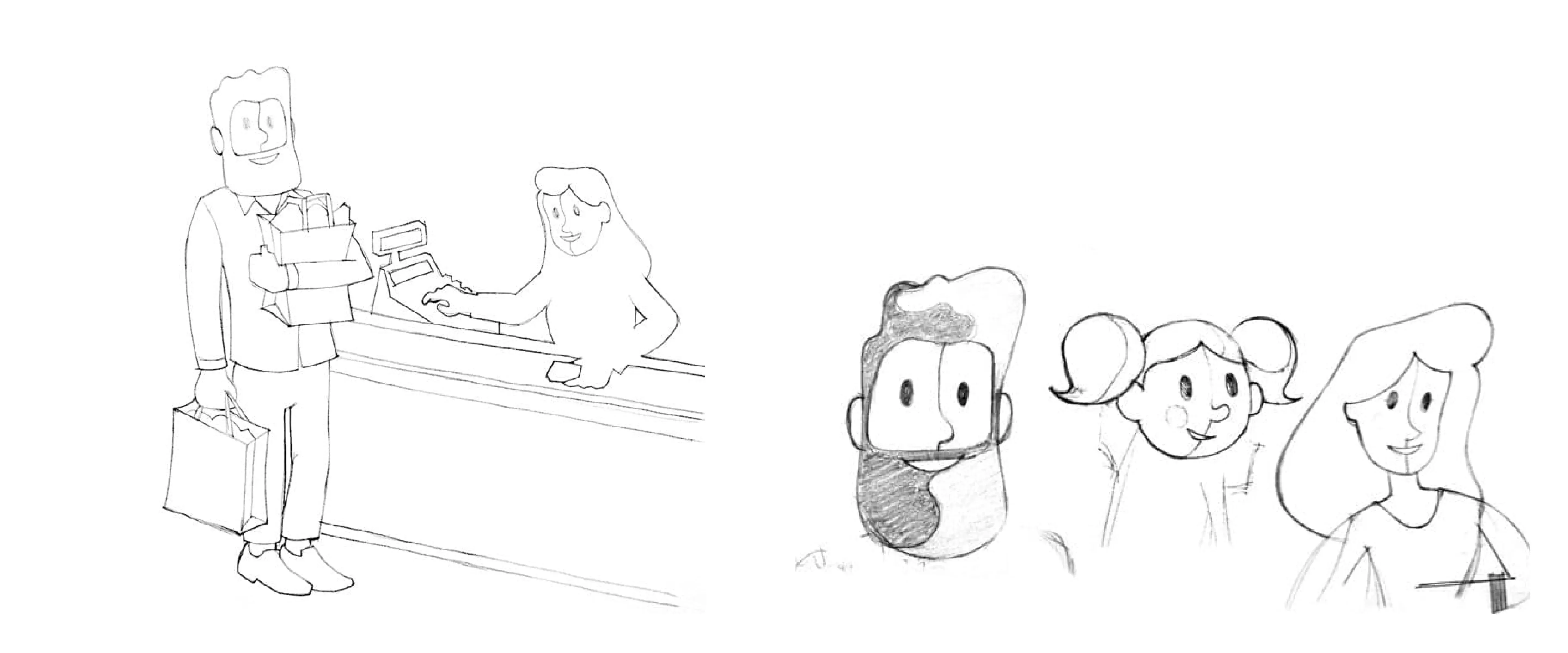
Characters
After an initial phase of study, together with Kitchen and Coop Adriatica we decided to create a set of illustrated characters to describe the differences among the ècoop services: on one side, the photographic representation was already widely in use in products, in advertising and in printed materials, therefore something new was warmly welcomed; on the other side, a photograph represents a precise and recognizable demographic target in a too neat way, while the ècoop customer and user base is much wider.This is why we decided to create and illustrate from scratch a set of characters, our Coop Members, and a set of scenes in order to use them for the four services.
Icons and symbols
From our illustrated characters and scenes we identified and extracted the visual elements distinguishing each service and we simplified them in order to use them in the digital interface and in the printed material. Eventually, both our characters and symbols designed for the digital devices defined the iconic language of the ècoop brand and have been used in the animated movies on the external digital signage and in the printed materials.
Consistency and recognisability
This teamwork and this design loop between digital and physical touchpoints lead to a very high visual consistency within the ècoop brand, whose colors, typography and symbols start from the architectural space, pass through the brand identity and the digital interfaces and end up to the printed brochures, maintaining coherence and creating a new and strong identity, yet coordinated with the iconic Coop brand. Not a breakthrough, an evolution instead.
Interface Design
Our work did not stop at the definition of the visual identity. We evolved it in a styleguide of the digital components, specifically adapted for the 32 inches touch-screens, and we designed all the flows and the interfaces of the ècoop touch app.For the second go-live planned for November 2015, we also designed all the interfaces for the Social Loan self-service machine. This specific touchpoint, provided with a 14 inches touch screen and a physical keyboard, required an adaptation of the interfaces, inherited from the ècoop visual styleguides.

Test
The first ècoop prototype was inaugurated on 7 September 2015, in the new ipercoop in Chioggia. From this moment on, we have collected quantitative feedback, verifying the analytical data collected from the touch screens, and qualitative, carrying out a new test session with customers and with the staff of the ècoop space. Based on the information collected, we have agreed on some changes to the CMS and further simplified the content structure.
Repeat
On November 21st, 2015, in the ipercoop in Rimini, the second version of the ècoop space was ready for the go-live, provided with a new touchpoint: the Social Loan self-service machine, allowing lenders to autonoumosly perform operations related to their savings booklet. During December, we conducted one more session of interviews and tests with Customers and Members, to collect qualitative feedback directly from a point of sale very grounded in the area. This feedback will inform the Coop Adriatica team about all further content reviews, scheduled for the end of January 2016.

Of all insights collected and shared with all the teams, this is probably the one that better answers the question that started this long journey: “Is it possible to sell services the same way we sell products on the shelves?” Indeed, it is possible to give an important visibility to the services, but time must be given to people: time to understand, time to evaluate the offers and to ask the opinion of the ones contributing to the final decision (husbands, wives, parents, children, employers, etc..). This asynchronicity between the moment when people become aware of a service and the moment when they decide to buy it is a phase that needs to be managed and that can create interesting opportunities of communication and trust building.
Outcome: working on the right things, together
One of the most important and critical phases of this project has been understanding which contents to display for each service, in such a contextual touchpoint and in such a particular time of the day.The research done in April and a roadmap shared with communication, design and development departments allowed all teams to clean up the backlog of features. In this way, those really expected emerged, while the previous ones have been repositioned in new emerging touchpoints, within the strict deadlines.Thanks to this project. Coop Adriatica started a new path towards digital innovation and collected precious experience that will be capitalized during the upcoming merger with Coop Estense and Coop Nord-Est in Coop Alleanza 3.0.
"GNV & Partners team gave us a very high level of support professionnaly and humanly speaking, to deploy a project which was totally new for us and for the world of retail in Italy. The competence and passion they put in their work are extremely rare to find somewhere else."
Project team

Paolo Valzania
Icon design & Illustration
