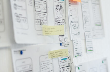
Monnalisa
Taking care of all steps of the Customer Experience, from the e-commerce website to the flagship stores.

Achievements
2
Touch-point designed
+25%
E-commerce revenue
Il cliente
Monnalisa is a world-renowned kids fashion brand, founded in Arezzo in 1968 by Piero Iacomoni, president, and Barbara Bertocci, creative director. Monnalisa has seven product lines which stand out for style and target age.The Tuscan brand operates in 64 countries. Its products are sold through its worldwide network of flagship stores and boutiques and through its e-commerce website.
Visit website: monnalisa.eu
Redesigning the e-commerce
The connection between us and Monnalisa began during the spring of 2015. They wanted to put us in charge of the redesign of their e-commerce website, which they judged out-of-date.The first time we met the Retail and Digital Manager of Monnalisa, Andrea Mattesini, the company had several websites: the e-commerce and the branded ones, one for each product line.
Our proposal was to converge all branded websites into one single place, in order to present all product lines together and to make a tight connection between the branded products pages and the e-commerce. Our hypothesis was that this shift should have lead users to an easier purchase. Our first purpose was to improve the customer experience, which was quite scattered over several websites. We wanted to shape Monnalisa online presence into something more robust and coherent, thus providing a big deal of help for the digital team, which at that time had to keep up-to-date and maintain eight websites instead of a single one.Our second purpose was to provide a responsive version of the Monnalisa website (none of their websites was responsive back then), improving usability from mobile devices, thus increasing sales conversions. For Monnalisa, the goal of this particular action was a 50% increase in turnover within two years.
We agreed that Magento must have been confirmed as the technological platform. Sintra Consulting was confirmed as front-end and back-end partner.
Mapping the ecosystem
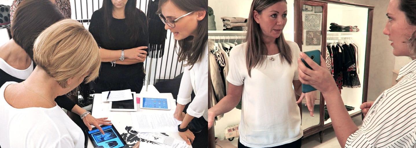
We began the project by facilitating a full-day workshop at Monnalisa headquarters, in Arezzo. The goal of this very early stage of the project was to map Monnalisa digital and non-digital ecosystem: we knew that there were eight websites to lead to a single simplified system, but should we consider other active touchpoints that we did not know yet? Which were relevant or influential actors for the customer experience? Which competitors should we keep in our radar?To collect information, we used the Territory Map, a tool studied by Marianna and Anna during the UX Intensive course in Copenhagen. This canvas helps to visualise the whole ecosystem of a service or a product: people, places, artefacts, technologies, competitors and all the connections among them. The benefit of a Territory Map is to make complexity clear and visible to all stakeholders, creating a shared vision and exploring opportunities for new strategies, in order to reorganise all entities and their existing connections.
Understanding what's offline to improve what's online
When we started the project, Monnalisa online turnover was quite residual. The main touchpoint of the Customer Experience was, and still is, the store, and the flagship store in particular. This is where sales assistants are trained to provide a tailor-made experience for their clients.
During our first session of user research on the field, we talked to the store managers and it was immediately clear to us that they offered an extremely high level of service to their clients, from the sale rituals in the stores to the follow-ups via phone or WhatsApp, from managing a reservation to taking care of dress fittings, which were totally in charge to sales assistants.Obviously, Monnalisa clients totally appreciated such service. Over time, they had built a tight relationship based on trust with sales assistants and thus with Monnalisa brand as well.
If this was the quality of the service provided in the stores, what should have been the experience through the e-commerce?
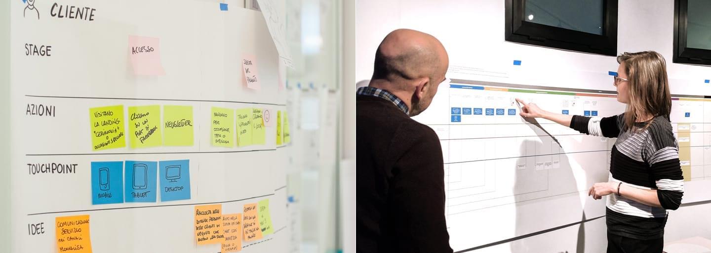
After a session of research on the field, together with the Monnalisa digital team, we mapped the Customer Journey and focused on the pain points. Our aim was to create a meaningful experience throughout online and offline customers interactions with Monnalisa service, to keep the curve of their satisfaction high.
We had quite a lot of integrations to consider and some of them were technical. We had to align brand language and brand identity; we had to consider that Monnalisa customers may be owners of a Fidelity or Gift Card viable on both channels; and that they can place an order online and collect it from the store.
From the beginning of the project, this tight connection between the e-commerce and the stores generated many important insights for the future and we kept track of them to explore interactions beyond digital touchpoints.
Redefining the digital identity
Monnalisa is a very recognisable brand, for the style of its clothes, for the tailor-made details, for the flagship store decors, for the cat-walks, the catalogues and even for its corporate communication sets.All previous websites were even designed to be immediately recognisable and aligned to their corresponding brands.There was a single huge problem: like any other brand in the fashion industry, Monnalisa articulates its business life in seasons and the product communication must keep the pace with this rhythm, being coherent with the ongoing season, with the photographic shooting and the mood defined for that season by the style department. Therefore, any visual solution becomes obsolete within one season, if it is too strong.
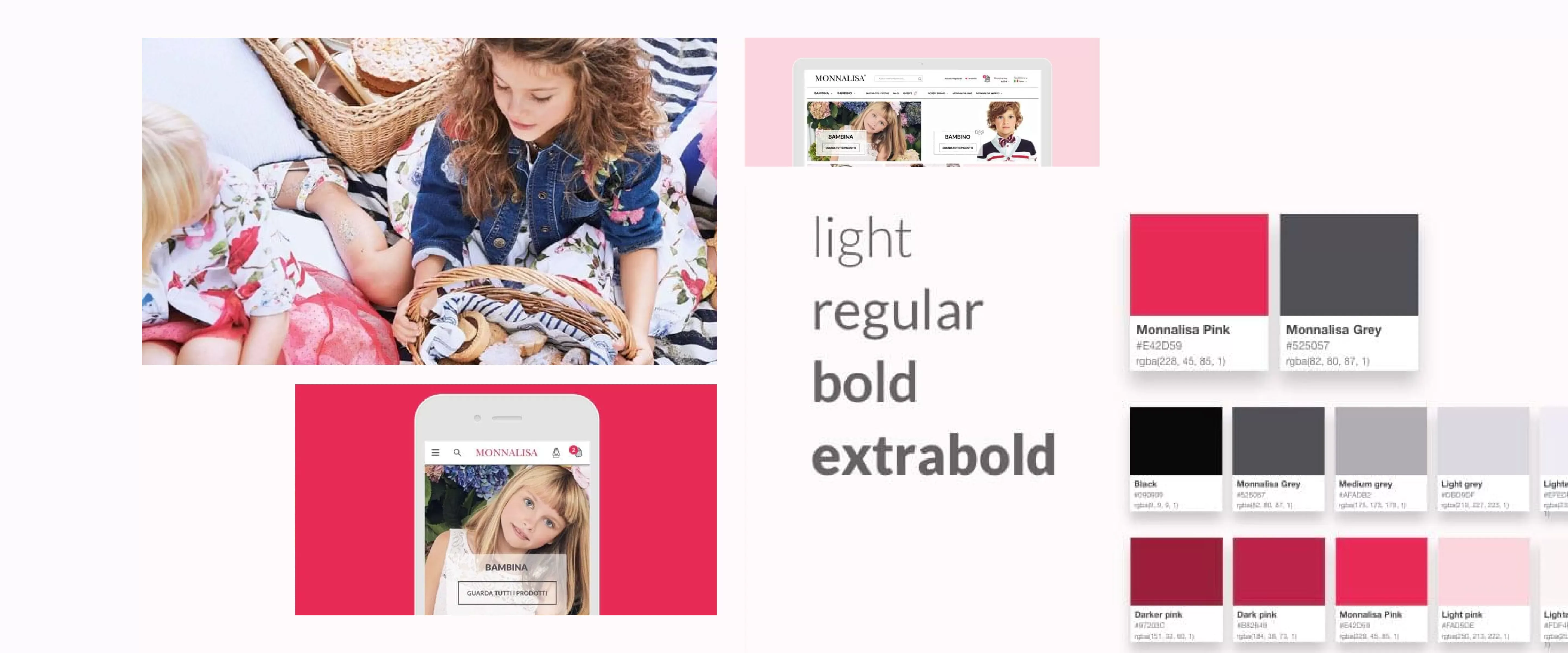
We followed a precise direction to define the visual language. Our choice was to build a robust visual system, consistently structured with Monnalisa brand and aesthetically recognisable, but we kept it content-neutral at the same time. The main focus should have been left to pictures and products as they represent the ongoing season.
We ended up creating a complete styleguide for Monnalisa e-commerce. We designed it to be light, not only in visual but also in performance terms, using very few and simple images and keeping in mind that the project had a responsive core.
Observing and intercepting behaviours
The e-commerce project has seen the light in the beginning of 2016 and during the following year, it brought to an increase in turnover by a 25%.
A few months after the go-live of the new website, our team met Monnalisa digital team to define the next steps.
The digital team told us that they observed new emerging behaviours in the boutiques. Sales assistants had started referring to the website to show clothing missing in store, ordering them online and delivering them in store. They also started to reserve a dress fitting for the special occasion dresses, the most expensive ones.
These behaviours lead us to two new projects: an app for sales assistants, to intercept these spontaneous behaviours and to offer new tools to empower them; and an extension for the e-commerce, connected with the sales assistants app, to allow reservation of special occasion dresses.
Thinking about the ecosystem, not only about the product
With this new project, we were about to create connections between digital and physical world, orchestrating different touchpoints throughout the experience of a customer.
We chose to address the project as a Service Design framework. We mapped the Customer Journey organising different touchpoints while seeing each product as part of the whole system, instead of considering them as isolated atoms.
Sprint and validation
By the end of summer 2016, we began working on this new project, starting from a user research session in the flagship stores around Italy. We added a session of remote user interviews with the stores in Hong Kong and Beijing, as China has the fastest-growing market and is the second Country selected to receive the app.
We ran a two-week sprint to create a low-fidelity fully functional prototype. One week later, we interviewed a small group of sales assistants and store managers and asked them to test our prototype, as we wanted to validate our initial ideas and the assumptions defined with Monnalisa during the kickoff meeting. We collected very important insights about how the service works today, crucial feedback on the Monnalisa product vision and important information about how to integrate this new digital service inside the stores and how to create connections with the usual customer relationship.
Mapping what happens today to design a service for the future
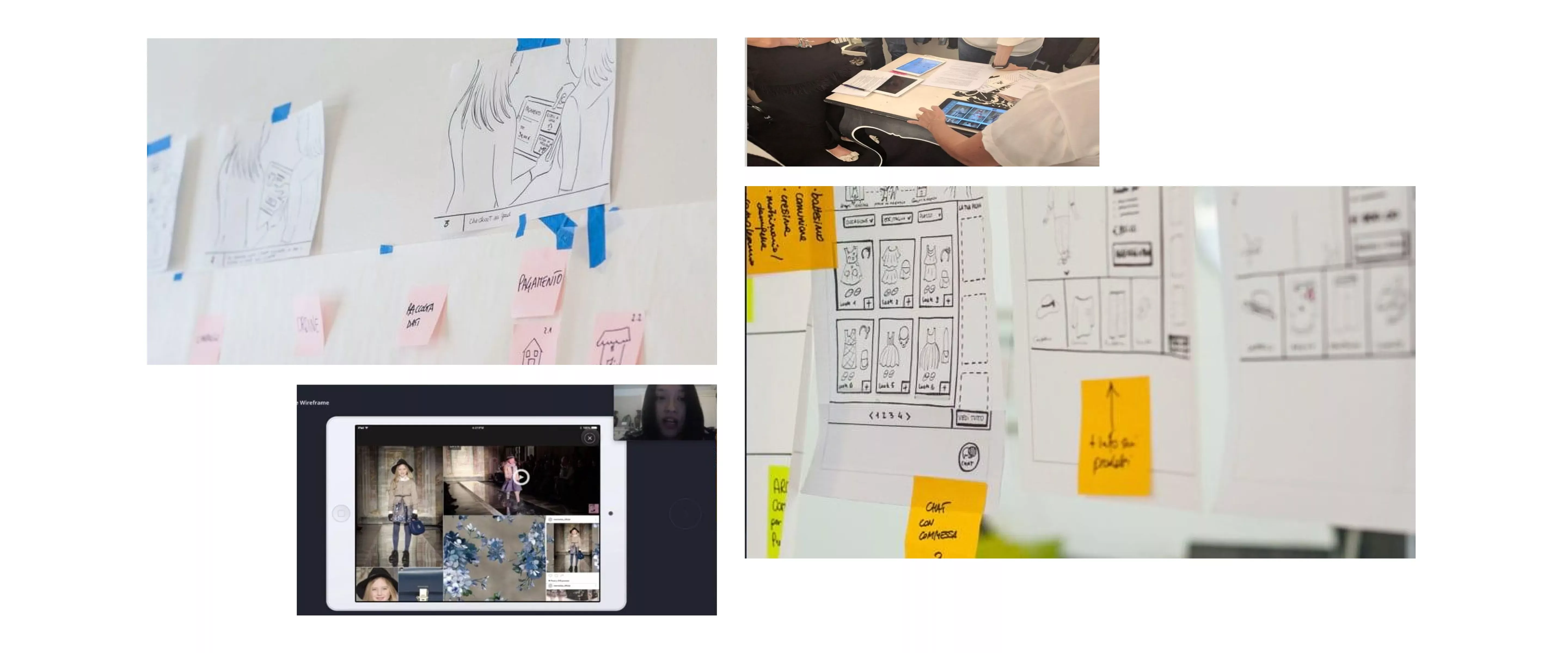
Given the results emerged from user research and keeping in mind which actors play a role in Monnalisa ecosystem, we started to design the reservation service of special occasion dresses. We used a couple of tools which helped us describe the stages of the service: the Scenario and the Service Blueprint.
Scenario
It consists of a series of images, in our case hand-drawn, representing the core steps of the journey. This scenario of the reservation service of Monnalisa dresses, as described during the brainstorming meeting, helped us empathising with real users (sales assistants and customers), and gave us a deeper understanding of their needs and expectations, which was very useful while detailing the service design. In this second phase, we took into account the interactions of all components (touchpoints) in order to ensure the smooth functioning of the service.
Service Blueprint
To understand how to meet the needs and how to coordinate all touchpoints described in the Scenario, we used the Service Blueprint, a tool that helps to envision the whole service, mapping the user experience on one hand and Monnalisa internal processes on the other hand. The Blueprint gives a good snapshot of all necessary activities to deliver the service, helps us to discuss with the client, to validate all design solutions step by step, to understand their feasibility and to think about how to implement it.
Designing the product
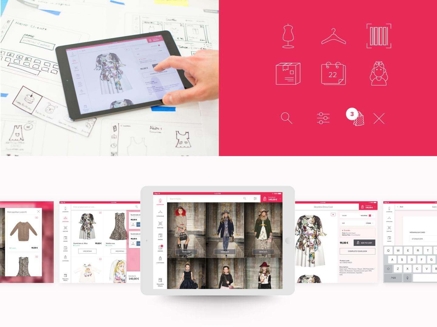
Once we’ve done understanding and mapping the service, we started designing and visualising the iPad app for sales assistants. We began evolving the prototype validated during user test sessions and extending the visual styleguide we defined for Monnalisa e-commerce, adding all necessary components.We explored and detailed all functionalities, working together with the Var Group mobile dev team and the Sintra Consulting backend dev team. Our aim was to collect precious information about the possibility of integrating data sources, POS for payments, barcode reader and the printer inside the store, to design a fully integrated system.Lastly, we designed all micro-behaviours and interactions in detail.
Work in progress
In the beginning of 2017, the Var Group team started developing the app for sales assistants. In the meantime, we are involved in a new project aimed at refactoring the front-end of the e-commerce, to improve interactions and performances from mobile devices.
Project team

Luca Salvini
Front-end advisor

Paolo Valzania
Icon design


