Soisy
Improving product vision and care by contaminating business and development, thanks to research and design.
The client
In 2016, from a dream of Pietro Cesati and Andrea Sandro, Soisy became reality as a marketplace for private loans based on social lending. After the first year of activity, in pure startup spirit, Soisy makes a bold pivot and proposes its marketplace as a payment method for e-commerce and physical stores.In 2018, the number of investors and applicants increases and the company consolidates a first layer of e-commerce and stores wanting to become partners. Soisy is reported by the industry press as one of the best fintech startups in Italy. Furthermore, it is selected by StartupBootCamp and increases its capital with a memorable crowdfunding campaign that was overfunded in only a few days.
Visit: soisy.it
Context
Soisy is a social lending platform that allows private investors to finance purchases through e-commerce or affiliated shops. Therefore, it is both a payment method and an investment portfolio.
After the pivot that twisted the initial business model, Soisy needed to validate the hypotheses on the new functionalities related to the Problem/Solution Fit phase. Furthermore, it was necessary to investigate users motivations and needs. Finally, it had to answer some questions related to the Product/Market Fit phase, to locate strategies and understand how to automate processes and scale quickly.
With these assumptions and that kind of affinity that sometimes happens between newly-known people, one morning in March, at the Fintech District in Milan, we met Pietro, Andrea, Francesco, Giorgia, Mariacristina, Enrico and Carlo for a kick-off workshop. At the end of the day, the picture was clear to us: Soisy had two souls that had to be balanced, namely the one of who asks for funding and the one of who invests. Furthermore, it had a third soul, the one of the partner, which represents the driving force of the system. Basically, it represents the soul of who sells products allowing customers to defer payment over time.The goals, at the end of the workshop, were two: increase the number of partners and the monthly income. The implicit goal was to get to know the actors involved in this business and the inter-relationships at the base of Soisy's social lending system.
We had a lot of data and metrics available, but not yet quality information. Basically we did not know why people act like they do
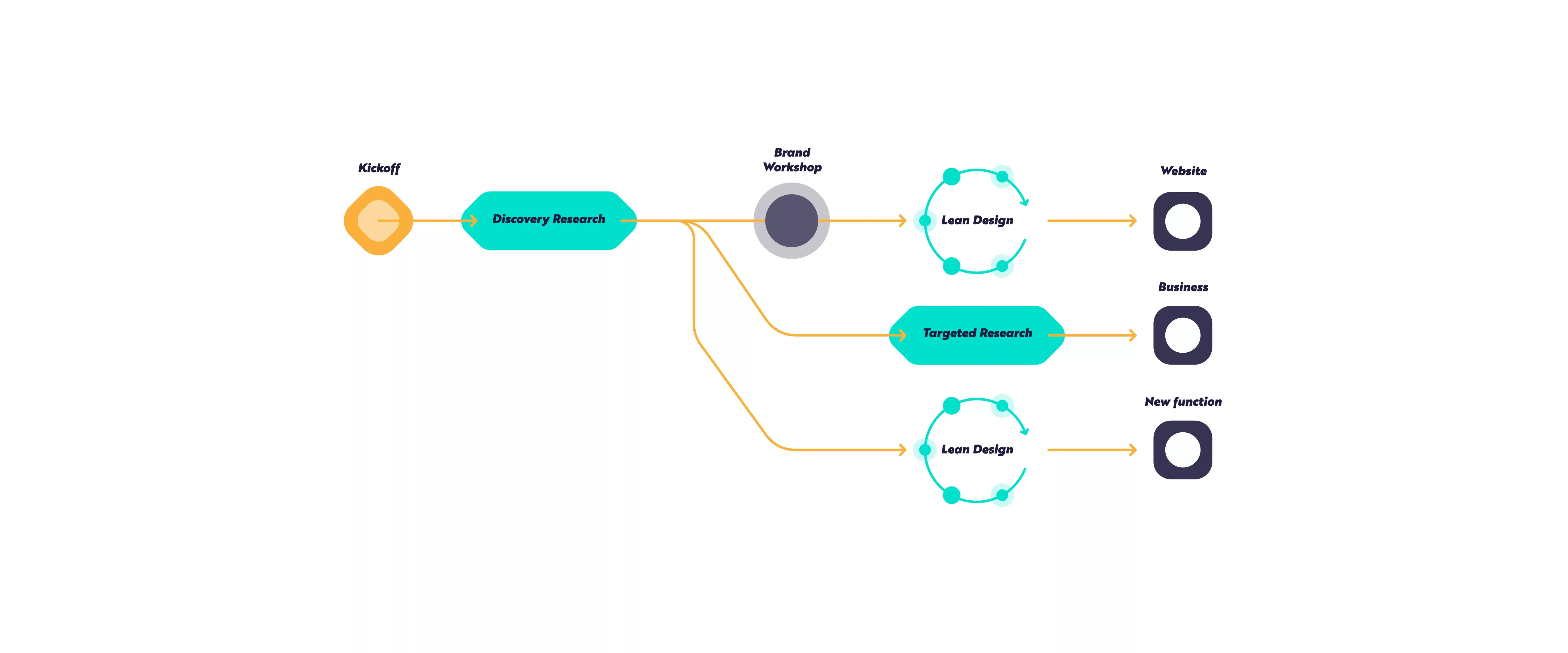
Brand and positioning
An early stage startup tends to focus on core aspects of its product, leaving the others in the background. Among the core aspects that Soisy was focused on, there was surely the brand identity. What was missing was a solid and coherent definition of how the product should have been perceived, illustrated and proposed and how Soisy intended to position it on the market in comparison with its competitors.Therefore, we started from a deep investigation of Soisy’s corporate culture, which was alive, solid and co-created. We began from its brand and its colors to build up the visual imaginary on its product. A creative work, where features are extracted from the details and are then made solid, to give a special flavor to everything else. In other words, we have created and consolidated a part of the brand identity.
Informing business choices and product development
The soul of Soisy is deeply “lean”: the team greatest ability lays in constantly collecting signals from customers and proposing continuous data and metrics based improvements. Soisy was, and still is, especially trained on "build" and "measure" steps of the lean cycle. On the other hand, to close the lean cycle it needed a boost on the "learn" step. At this point of the process, our teams started working together.For the first two months we focused on discovery activities, by conducting detailed qualitative surveys to the three main stakeholders (partners, investors and users) both remotely and in their context. At the same time, we travelled around Italy to observe how the service was presented, perceived and used.
The goal was to understand the position of Soisy’s service within a more complex environment. In this ecosystem the three stakeholders operate according to their habits, motivations, needs and different problems, each in its specific moment, which influences the experience of the others, by flowing into it.
We mapped the entire service and the inter-relationships among stakeholders into a series of blueprints, which highlighted the core aspects of the experience, in order to inform a series of designs and business choices thoroughly.
We have discovered a series of crucial information. Here are some:
- the main touchpoint that presented Soisy to the "public" was through partners, but they did not have clear information on what to say;
- from a partner point of view, there was a time gap between the on-boarding on Soisy platform and the first payment by installments order, which created a friction that led partners to not recommend this new payment system;
- people who intend to request microfinance during a purchase are looking for few and very specific information. To understand whether they can trust or not a company, people are looking for very clear content and touchpoints;
- for an investor, the interest rate is never the most important element of choice.
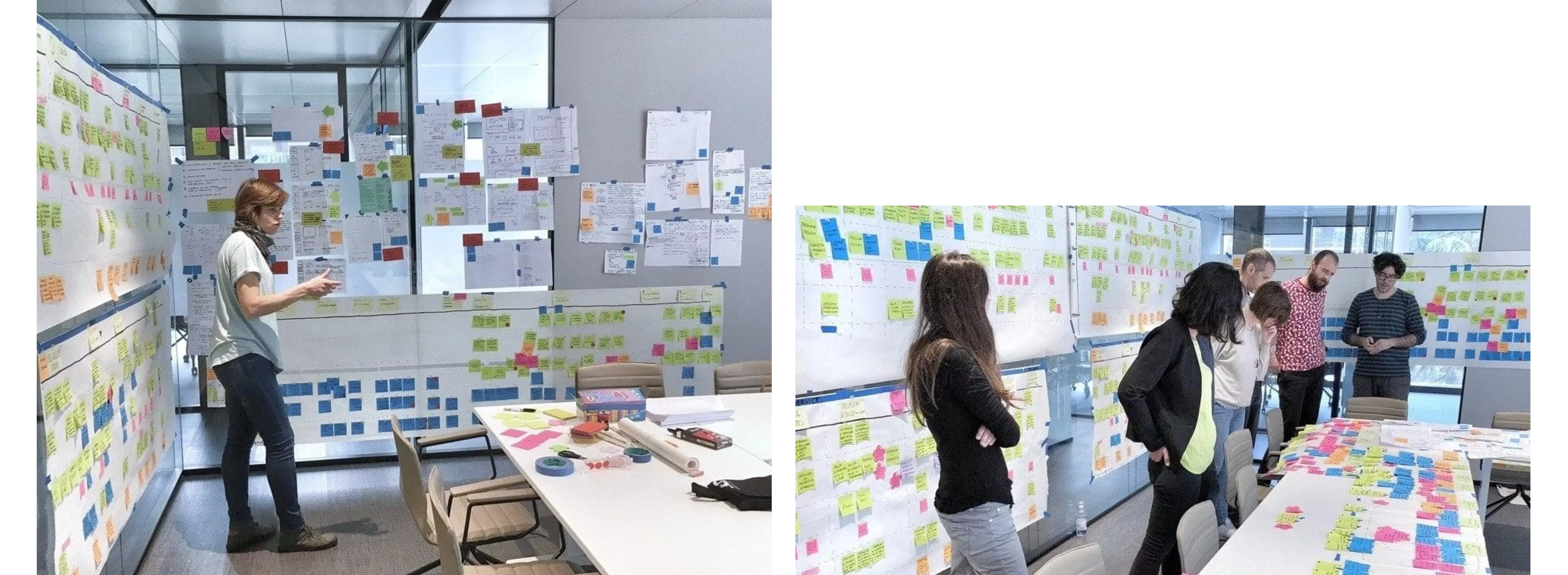
Co-design: a bridge from business to development
Once we identified channels, relationships and main friction elements within the service, we have worked on generating a large number of possible pre-solutions that, together with the report of research results, have been the main focus of our second workshop.
Together with Soisy, we discussed, pondered and chose solutions based on the positive impact these would have had on the overall experience of the three main stakeholders. Finally, we evaluated the necessary energies for implementing these solutions.
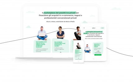
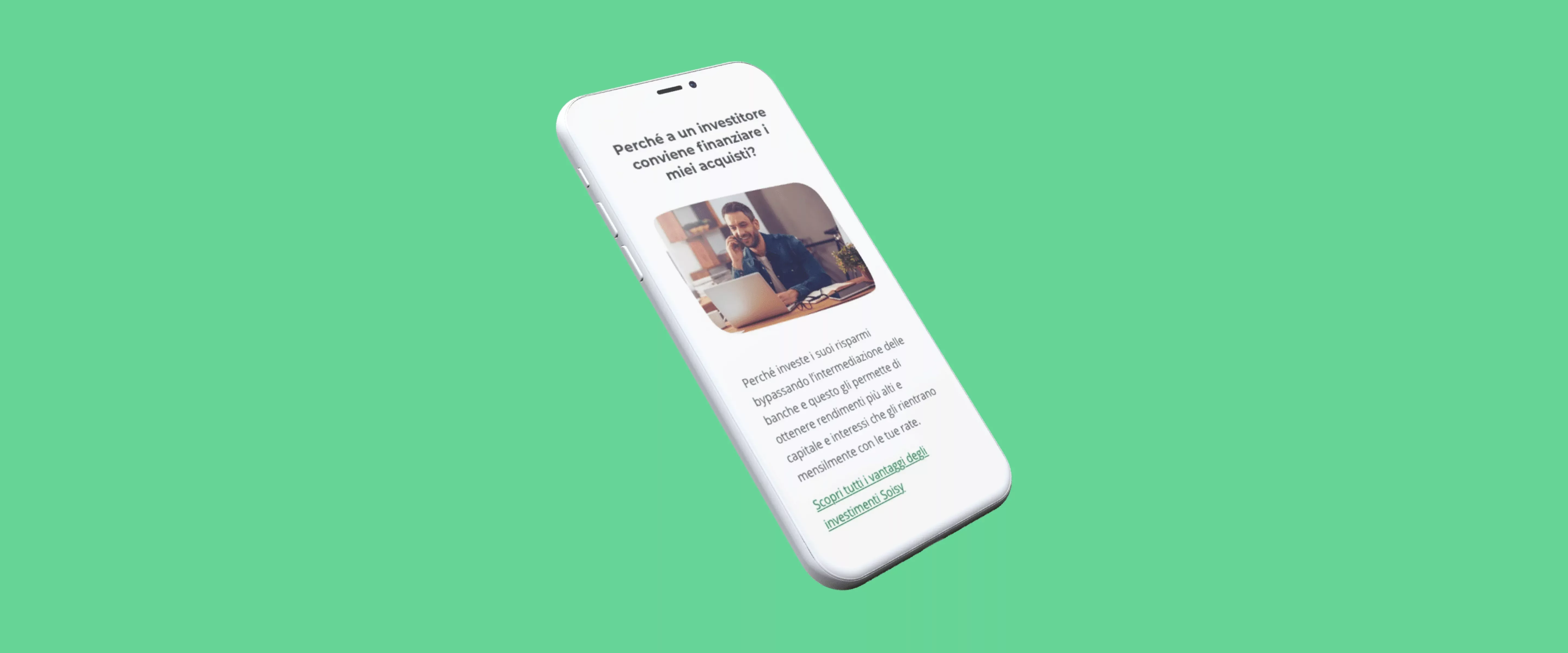
Among the most valuable and priority solutions that we had to implement, we have agreed to start from the website, to shape information and communication by adding a new section "ask for a finance" and by defining a basic design system.
Strengthening brand identity
From a visual point of view, we decided to strengthen and redefine Soisy's identity by building a solid and recognizable brand.
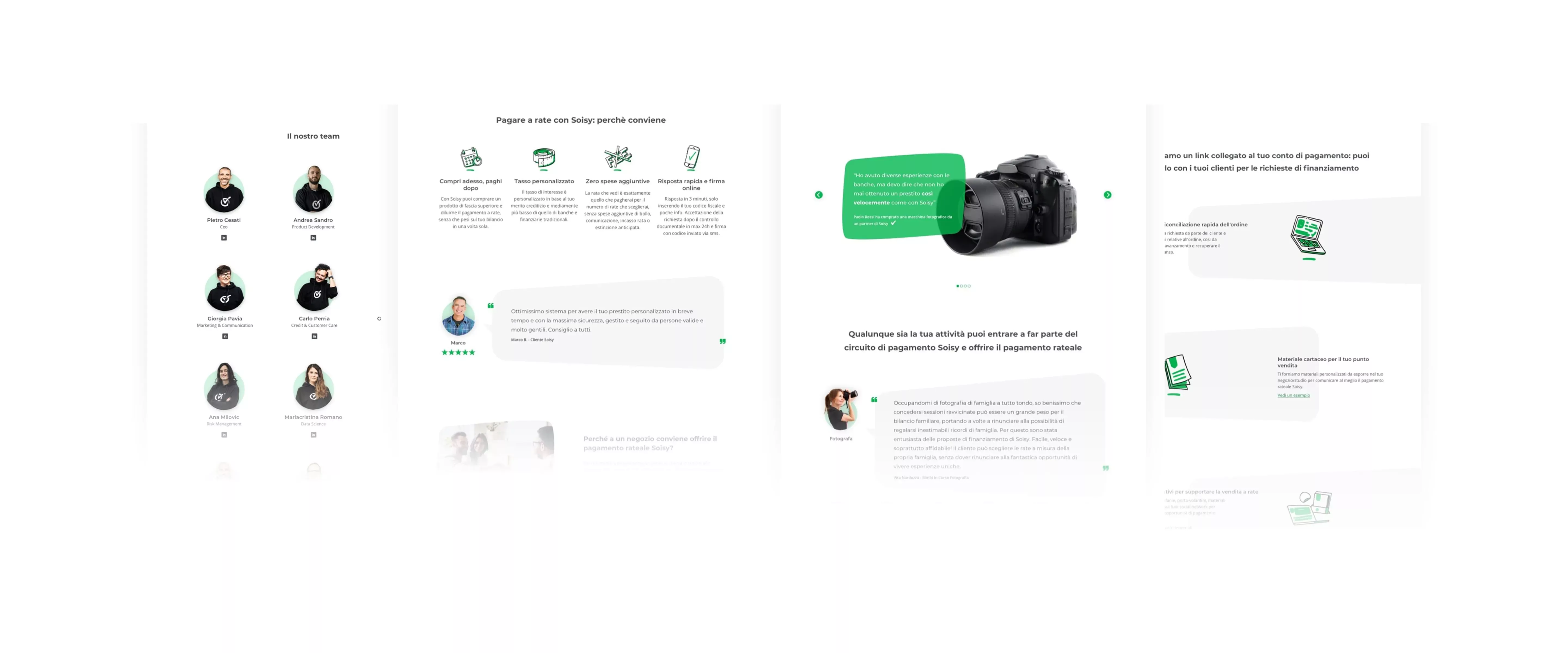
We have explored and defined distinctive aspects of Soisy identity with Brand Canvas workshop, mapping the most important aspects for its recognition and tracing more specific guidelines.
Soisy is a smart and digital company, very passionate about what it does, that really cares about its customers and where the human factor is a dominant feature: these aspects represent Soisy’s edge. We have consolidated these features in a simple, clean and fluid look & feel, combining sharp lines and soft shapes, photographic images and hand-drawn illustrations. Furthermore, we have created transparent, direct and non-institutional contents, able to establishing a real connection with the user.
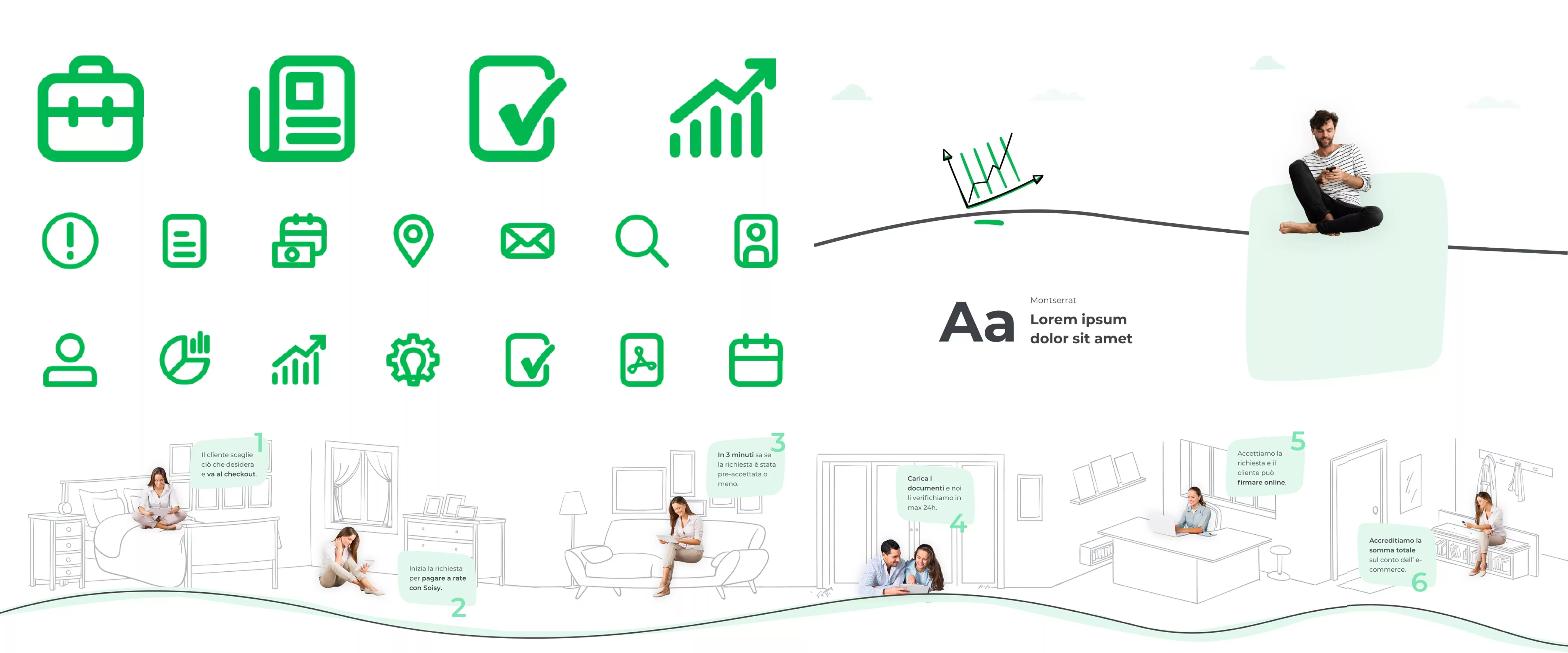
Once we defined the brand identity, we developed a consistent design system that included aesthetic and functional patterns. We have normalized and redefined colors palette, typography, grids, spacing and interface elements. We paid peculiar attention to the illustrations and the iconographic system, to favor a more direct communication and give a very human imprint to the brand. In fact, it is both one of the core values and one of users most appreciable trait. Especially, we have chosen to describe the operation of the platform using visual schemes and illustrations, adopting a non-institutional tone and reducing content complexity.
Design, in between business and development
We always felt part of Soisy internal team and never a team of consultants working for Soisy.
During a cross-team retrospective we had discussion that raised a strong concept: design is an essential strategic point of view. In fact, both its background and perspective are able to implement technical and business factors.When the second phase of our job started, the support of Tangible to Soisy went from a project-based consultancy to an extension of the internal product development team. Although a product vision was present in Soisy, it had to be supported and consolidated through experience design processes.
Impact
"It helped us cultivate and strengthen Soisy’s care for its product, allowing us to spread throughout the team the awareness of how crucial this type of care is for a company like ours; has expanded our skills, giving us tools to understand, investigate, analyze and improve the experience of our customers and our product.After our collaboration, the attention and focus of our team on these issues has increased systematically: all our dynamics have been enriched with new perspectives."
"Working with Tangible was a real pleasure: informal approach, direct contact, presence and availability. Working with Ilaria, Daniele and Veronica really gave us a lot of energy and enthusiasm. We thought we had hired them to fix our website, but in the end, they transformed us from the inside, clearly improving our approach to themes like UX and design"
"In the history of Soisy, Tangible is one of the strongest partners we ever worked with. I believe that our collaboration was so profitable because of their ability to adapt to our specifics and to our working method. Without proposing ready-made solutions we worked together to produce unique value for our customers. In doing so, they brought us strong UX and UI skills, which influenced our team and made us reflect on the importance of these aspects. At this point, the sentence "ask for Tangible support" is an omnipresent phrase in Soisy's dynamics. And then Daniele, Ilaria and Veronica are also very nice, which never hurts."
Project team
Veronica Fasulo
UI Designer

Luca Salvini
Front-end Advisor

Paolo Valzania
Icon Designer & Illustrator
