TeiaCare Manager App
Improve the user experience of the Ancelia Manager app in order to increase customer perceived value and user engagement
TeiaCare
TeiaCare is a startup working in the field of long-term care by creating Artificial Intelligence systems to generate innovative technological solutions that combine care needs and management requirements.
A data collection solution for Residential Care Facilities (RCFs)
Ancelia is the solution based on sophisticated Artificial Intelligence algorithms developed by TeiaCare for the world of Residential Care Facilities, designed to monitor the health status of residents and provide data to healthcare staff (nurses, caregivers, nursing coordinators, and area managers). It can help client facilities improve the quality of care while optimizing management resources.
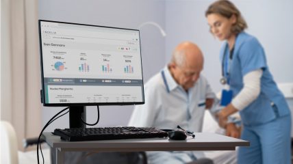
The goal of the collaboration with Tangible was to study and simplify user access to data through a better user experience of the Manager App, a system through which Residential Care Facility managers can, among other things, monitor the workload of caregivers and nurses and the quality of healthcare services provided to their guests. In particular, the redesign focused on role-based visualizations and functionalities and improving the understanding of the data displayed in the views and reports generated by the system.
The management dashboard for data processing
Through an optical sensor placed above the bed of each resident in the RCFs, real-time data is collected to ensure prompt, timely, and resident-specific care. The analysis of this continuous flow of data ensures an improvement in the quality of care provided and allows Ancelia to provide essential information to ensure sustainability, efficiency, and competitiveness for each facility.
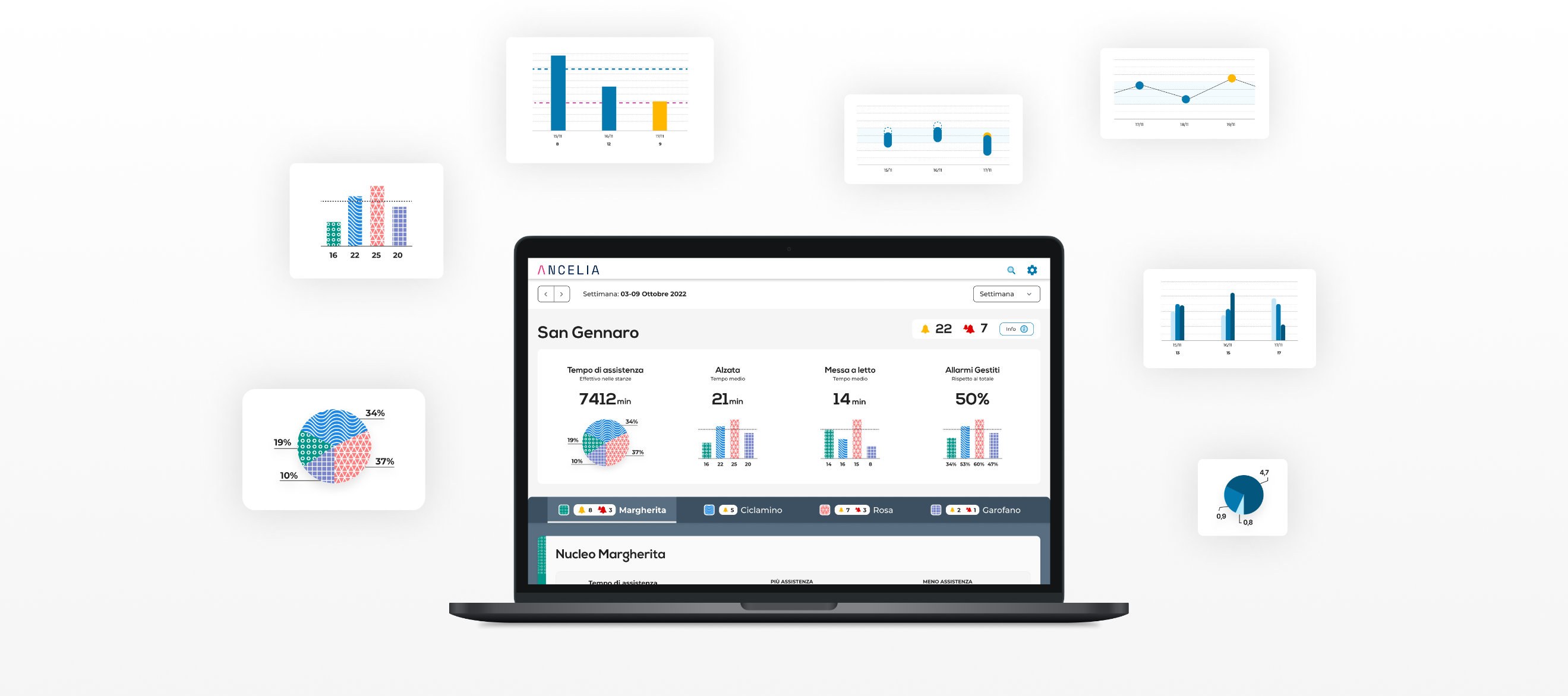
One of the key components of the system is the Manager App, which allows for the collection, visualization, and generation of reports on a large amount of data collected by the system. These reports show the trend of the RCFs, enabling managers to manage rooms, units, and residents, with a focus on the most at-risk or heavily loaded rooms, thus facilitating socio-sanitary reorganization and management.
The business solution
The Manager App adds value to the management layer of the facilities. The data collected and processed by the system is useful for making organizational decisions and therefore improving performance.
This application has two objectives:
To highlight to managers the weaknesses in staff management and operational efficiency
To always monitor the most critical aspects related to the well-being of their guests, facilitating the resolution of alarm situations that arise in case of incorrect postures, absences from the bed or other dangerous conditions for elderly residents suffering from senile dementia such as Alzheimer's.
In this sense, the Manager App gains market potential because it is a key solution for Residential Care Facilities, providing operational and monitoring tools to management levels of the facilities. The development of a dedicated monitoring dashboard for managers of the residences makes the Ancelia platform not only a management tool but also a process optimization system.
During the design phase, our biggest challenge was to find a logic with which to determine a deterioration in the resident's health conditions, starting from, for example, their state of agitation. In particular, the difficulty was in defining specific thresholds and averages beyond which it is necessary to alert the healthcare staff.
Why was it a problem? Generally, to provide evaluations with respect to specific data, it is necessary to standardize the data. In this case, however, since we were dealing with very different healthcare needs among the residents of the facilities (because they range from completely self-sufficient residents to those immobilized in bed), it was not possible to define reference parameters that could frame the situation as "average".
So the idea was to base the evaluations of the efficiency of the structure, not so much on specific data, but on weekly/monthly temporal trends. In practice, the system shows the comparison between the "usual condition", i.e., an average of the values obtained from previous reference periods compared to current values. The qualitative evaluation is based on this comparison.
Data collection for managers
Another delicate aspect we had to consider was the visual language.
Most managers who deal with the data presented by the app, on the one hand, are not accustomed to statistical analysis and numerical data processing, and on the other hand, they have very little time to dedicate to monitoring these statistics.
The solution was to create a dashboard with a well-defined hierarchy of information, divided into three levels of detail: the first level of information deals with the most serious problems, and if you want to delve deeper, you can reach the second level that shows an overview of information aggregated by theme, which in turn can be expanded by opening the third level, which shows graphs and specific data on the trend of monitoring data for each individual theme.
This ensures that the information obtained meets the user's needs while respecting both their time availability and their expertise in data.
The process we followed
Between research and field interviews
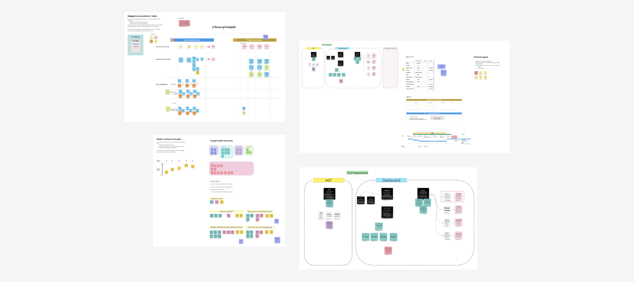
The design process started for us with the research phase. In particular, we decided together with the client to conduct field observation to understand the habits and behaviors of our users, and during the in-person observation, we took the opportunity to interview some managerial roles in order to gather information about their needs, their critical points, and concerns related to the use of certain data.
We gained a better understanding of what an RSA manager needed and what the strengths and weaknesses of our app would be.
Creating the Design System
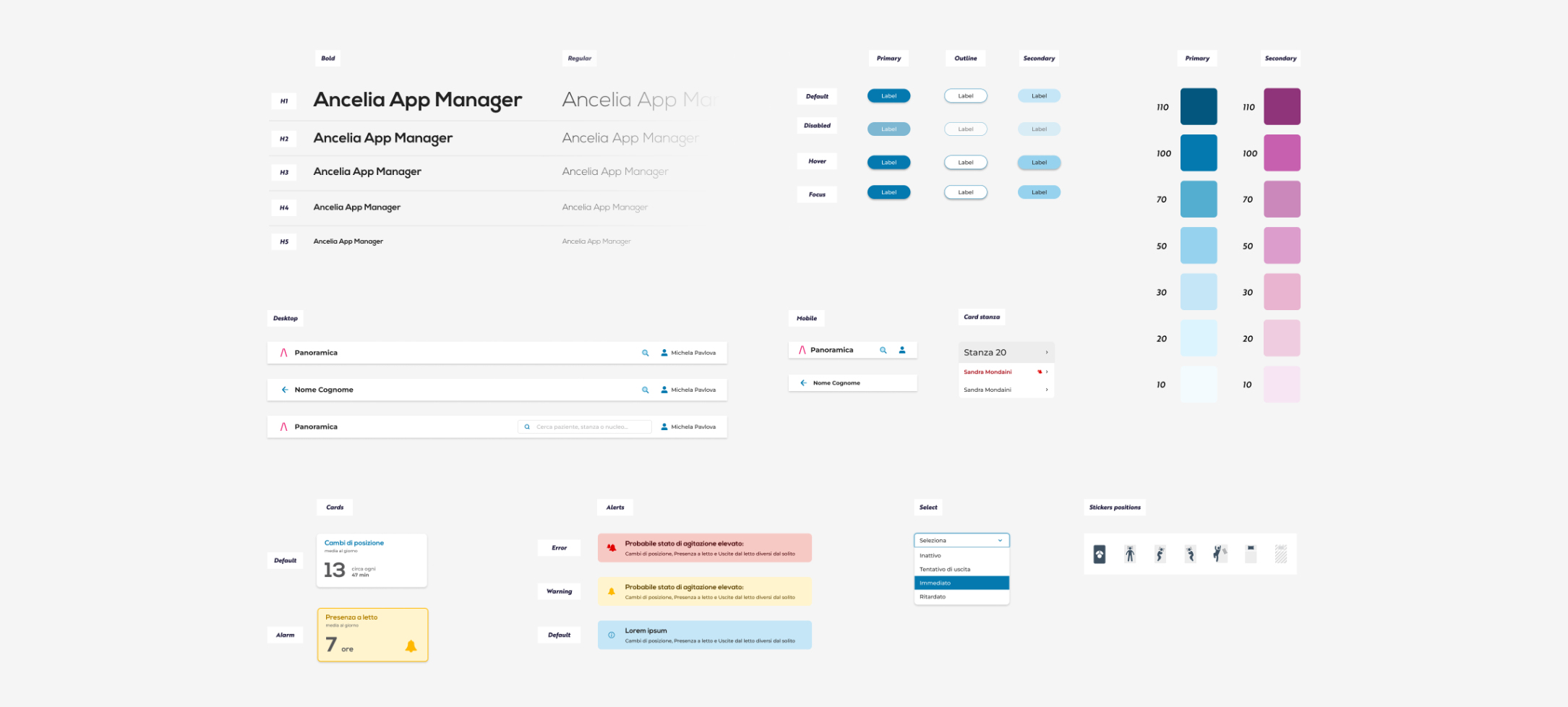
Working on an existing visual identity that needed to be maintained, our job was to create a Design System starting from the development of components based on the current state and defining a path for its evolution.
The Design System is a set of rules, principles, and tools used to consistently and scalably create the graphic interface of a digital product.
To learn more: https://tangible.is/thinking/2023/03/evolvere-lesperienza-utente-in-modo-inclusivo
In the creation of the Design System, we defined the Foundations by parameterizing colors, typography, grids, and all those elements that define the basic rules of a design system structure.
Then we identified all the elements used in the visual that could be organized as components.
From buttons to headers, from cards to graphs, all the visual design was sorted, organized, and componentized, ready to be modularly used on different views.
The Design System represents a new working tool for TeiaCare. The development department, particularly the front end, now has a clear guide to all the rules and components used on the different views, which can be used to easily manage changes and evolutions of the Ancelia product in its desktop, tablet, wall-mounted monitor, and mobile versions. In this way, TeiaCare can independently create new views, pages, or functionalities, leveraging a modular system designed specifically for this purpose, while maintaining formal and stylistic coherence across various channels and touchpoints.
With the implementation of the Design System, TeiaCare developers have at their disposal a set of tools that allows them to build new interfaces and functionalities, optimizing development time and costs.
Testing with users to validate the interface
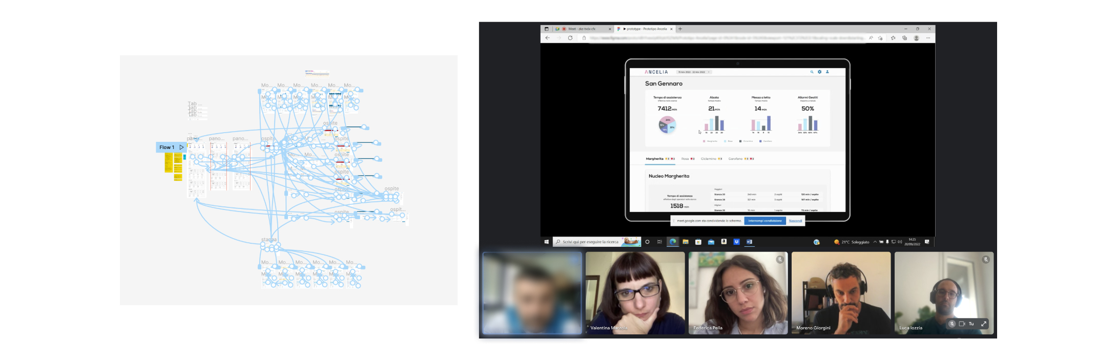
After defining the parameters for improving the Manager App experience, we designed the new views and produced navigable wireframes. Wireframes represent a skeleton of the interface that has the double advantage of being a basis for the design process and a useful tool for validation through user research. In this case, we produced medium-high fidelity prototypes from the wireframes, able to simulate the final interactions of the product without actually building the product. The tests that followed allowed us to validate the assumptions about the product and interface that led us to those solutions.
In this phase, we involved the CTO to make him aware of the information and evidence that emerged, evidence that became opportunities for improvement on which to iterate.
Accessibility in data visualizations
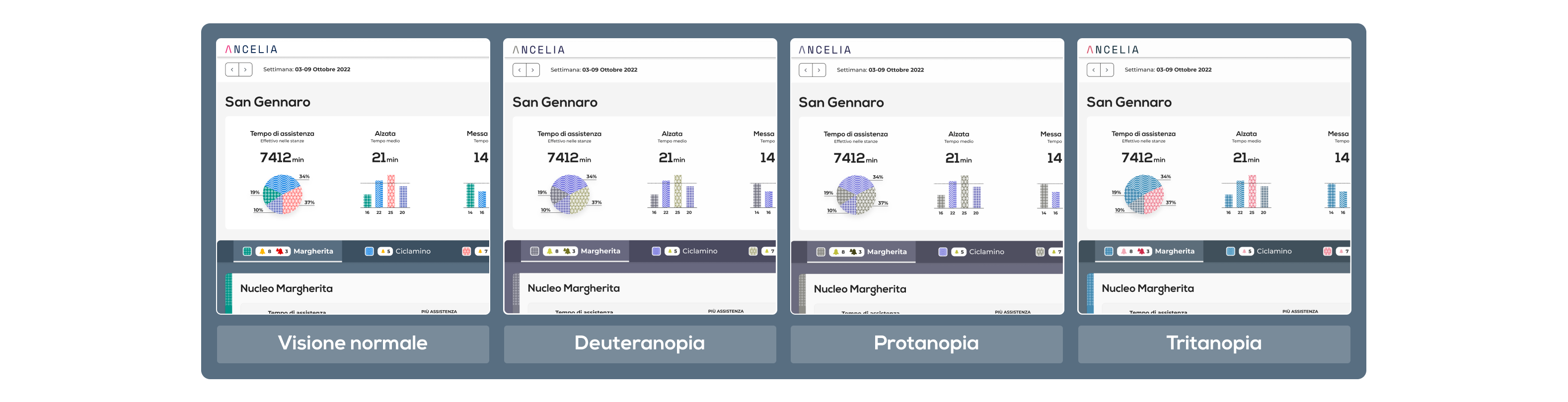
When it comes to health and healthcare, we tend to think more about accessibility. This theme, which is essential to us in designing a service, was also very important to the client who showed interest and willingness to analyze and apply good accessibility practices to the project. Our attention to this topic started from the early design stages and was then implemented in the UI, in which we paid great attention not only to the font size or the use of icons, but especially on the accessibility of graphs and colors. The usability of the data in the graphs related to the different reference entries was a highly considered point that led us to iterate several times on the graph section, until an adequate and accessible final solution was reached, even for those who may have color blindness or low vision. Associating a texture with the color of the graph was one of the solutions adopted to help understand and identify the different data. Furthermore, using icons combined with text and colors allowed us to communicate information even when space was limited.
Collaboration as a basis for dialogue
For us, communication with developers is an important issue that starts from the beginning of the project: the development team is always aligned with the decisions made during the design phase and is constantly consulted for advice and viewpoints. Communication among the different roles is essential to arrive aligned at the end of the process and to bring coherence and uniformity to the project.
Once the UI is completed, an information transfer step between UI designers and developers called Handoff is always carried out. This is a very important phase and all the decisions and information that have been documented during the project are passed on to the developers to provide a precise idea of how they will be implemented.
At the end of the App Manager project, the two teams decided to continue the redesign activities on additional areas of the Ancelia product, investigating, optimizing, and enhancing new and existing functionalities.
Moreno Giorgini
Project Manager & Experience Designer


Want more information about this project or would you like to discuss a similar project for your business?